
Recruitment.
Darwinbox's recruitment module was mature on desktop and thin on mobile. Benchmarking six ATS products showed every capability gap belonged to someone other than the recruiter. The product already tracked five ways a hire stalls and surfaced none of them. I designed two mobile flows against that: raise a requisition, and screen résumés.
Outcome: Both flows shipped in 2022. I left before the post-launch data came back, so the checks below are the ones I defined, not ones I ran.
Improve recruitment, on mobile.
Darwinbox is an enterprise HRMS with a mature recruitment module on desktop. The mobile side was thinner, and the team wanted it brought up. That was the brief.
I started by benchmarking the module against the market leaders, which is where the shape of the work came from. I had about a month, so where I chose to spend it mattered more than anything else I did.
Where the category has moved.
I mapped six recruitment products against the capability language each one uses to describe itself, then fitted Darwinbox's stages onto the same axes.
Most rows matched. The interesting result was in the rows that didn't, because they point at where the category has converged and Darwinbox hasn't caught up yet.
| Capability | Darwinbox | Lever | SmartRecruiters | Workday | Greenhouse | LinkedIn Referrals |
|---|---|---|---|---|---|---|
| Source | ● | ● | ● | ● | ● | ● |
| Advertise | ● | ● | ● | ● | ● | ○ |
| Refer | ● | ● | ● | ● | ● | ● |
| Track | ● | ● | ● | ● | ● | ● |
| Evaluate | ● | ● | ● | ● | ● | ○ |
| Offer | ● | ● | ● | ● | ● | ○ |
| Onboard | ● | ○ | ● | ● | ○ | ○ |
| Collaborate | ○ | ● | ● | ● | ● | ● |
| Candidate status feedback | ○ | ● | ● | ● | ● | ● |
| Referrer status feedback | ○ | ● | ○ | ● | ○ | ● |
| Interview scheduling assist | ○ | ● | ● | ● | ● | ○ |
| Mobile parity | ○ | ● | ● | ● | ● | ○ |
- All five gaps are about someone other than the recruiter. Read the five rows Darwinbox trails on and they turn out to be one gap, not five. Collaboration, candidate status, referrer status, scheduling assistance and mobile: every one of them is a case of somebody who isn't the recruiter needing to see something or do something. Darwinbox has built a strong product for the recruiter. The leaders have carried on building for everyone else in the room, and that's where the daylight is.
- Which makes mobile the right place to close it. The people in those five rows are hiring managers, interview panels, candidates and referrers. None of them sit in an ATS all day. If the gap is about reaching people away from a desk, a phone is the obvious instrument, and that's what the brief already asked for.
Where the jobs-to-be-done came from.
The recruiters described the coordination work as part of their job. The audit showed the product had already been tracking it.
- Recruiters. They live in this module all day. The recruiter jobs-to-be-done come straight out of those conversations.
- The product itself. All 16 desktop screens, field by field: every list, filter, widget and state. This is where the five stall states turned up, sitting in a collapsed filter panel.
- Six competitors. The outside view. When five other products all ship something Darwinbox doesn't, that's a signal about the category rather than a matter of taste.
Five people touch a hire.
The desktop product is built around the recruiter, which makes sense, because they're the only one in the process using it all day. The other four rarely open it, and three of those four are usually who a hire is waiting on.

Motivation
Close roles fast enough to keep the business staffed; Keep good candidates warm and engaged; Not be the reason a hire stalled.
Goals
Screen 50+ applications without reading all of them; Schedule without checking back and forth; Keep every party informed at every stage.
Tasks
Source, post, screen, call; Relay screening feedback to the manager; Coordinate manager, panel and candidate; Chase panel feedback until it arrives.
Pain points
No auto-reject rule against basic criteria; No view of candidate slots against panel availability; No way to nudge a panelist who has gone quiet; Every handoff in the system routes through them.
Additional information
In conversation they asked for a scheduling assistant, in almost those words: something showing candidate slots and interviewer availability side by side. They were describing a feature most of the leaders now ship. Without it, they do the job by hand.

Motivation
Fill the gap on their team without it eating the week; Hire the right person, not the available one.
Goals
Be clear about the requisition, to save time; See only eligible candidates; Stay informed on the status of every candidate.
Tasks
Figure out the requirement, raise the requisition; Build the JD, brief the recruiter; Review résumés, interview, read feedback; Debrief the panel, decide.
Pain points
No inbox for candidates, so résumés arrive by email or not at all; Opens the desktop ATS perhaps twice a month; No single view of a candidate across rounds; A rejected requisition starts over from zero.
Additional information
A hiring manager isn't a recruiter and isn't going to start behaving like one. They don't go to the ATS, so the ATS has to reach them where they already are: a task queue that also holds their loan approvals and expense reviews. Most of what I designed follows from taking that seriously.



They're the least desk-bound people in the process, and feedback is currently the most desk-bound task. Pending for feedback is where hires sit longest, and that mismatch is a large part of why.

By the time they're waiting, the panel has usually written its feedback and the manager has often decided. The information is in the system. There's just no route from it to the person it's about.

There's an industry term for this. LinkedIn Referrals sells its product on closing what it calls the referrals black hole. I'd written that phrase in my competitor notes weeks before I drew the blueprint and didn't connect the two until later.
How a hire actually moves.
I blueprinted one hire end to end. Five people on a shared timeline, so a step sitting further right happens later, and two steps in the same column happen at the same moment. The recruiter and the candidate share a column at the screening call because they're on the same call.
Dashed bars are waits. The dots mark where somebody needs something the product doesn't give them.
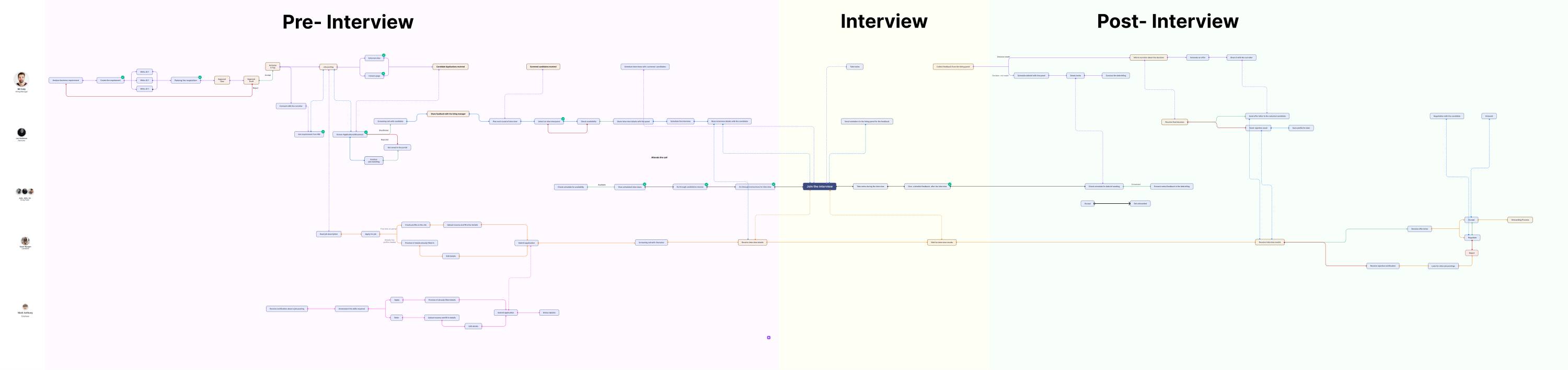
Tap any step to read what it does. Use the buttons to walk the three views.
Eight of these handoffs are between other people entirely. A panelist owes the manager feedback. The manager owes the candidate a decision. None of it needs a recruiter. The product routes every one of them through the recruiter anyway, because there's nowhere else for a handoff to live. That's what turns eight into thirteen.
Four of the recruiter's thirteen steps exist for no other reason. Relay the screening call, schedule the interviews, coordinate the day, chase the feedback. Build the direct channels and those four steps don't get faster. They stop existing.
The dashed bars are the other half of it. A candidate and a referrer, waiting. The referrer's bar runs for more than half the hire.
The product already tracks five ways a hire stalls.
They're in the advanced-search panel of the desktop candidate list, offered as filter values. Between them they cover most of the ways a hire gets stuck, which means the data model is already doing the hard part.
What's missing is a surface. None of these states are shown anywhere a non-recruiter would look, and in every one of them the person holding things up isn't a recruiter. That was the opening, and it's what I built into.
The product already knows every way a hire stalls. It just never shows those states to the person who could clear them.
Knows (in the data model)
Advanced search → Status → Stage Status
- Pending for scheduling
- Pending for interview
- Pending for feedback
- Pending for decision
- Interview did not happen
Shows (in the task list)
Overview → My Tasks → Show
- Requisition Approval
- Offer letter approval
A stall is queryable, but not visible
To find a stalled hire today you have to suspect it first, then go looking with a filter. The only person doing that is the recruiter, which is a lot of surface area for one role to watch.
The task list is scoped to approvals
The existing task widget covers requisition and offer-letter approvals, both of which wait on your signature. The stall states wait on someone's response instead, and there's no equivalent home for those yet.
The people who could clear it aren't desktop users
In all five states the person holding things up is a hiring manager who hasn't screened, a panelist who hasn't written feedback, or a manager who hasn't decided. All of them are exactly who a mobile app is best placed to reach.
Nine decisions, and the two steps they fix.
Everything below answers a specific step in that journey. Each decision carries a chip naming the step it addresses, and clicking it takes you back to that point in the blueprint.
The checks under each decision are the ones I defined at the time. I left before the data came back.
Two steps, two users. Raise requisition is the hiring manager's. Screen résumés is the recruiter's. Both are points where a hire stops moving until the person who owns that step acts.
First, two ways in.
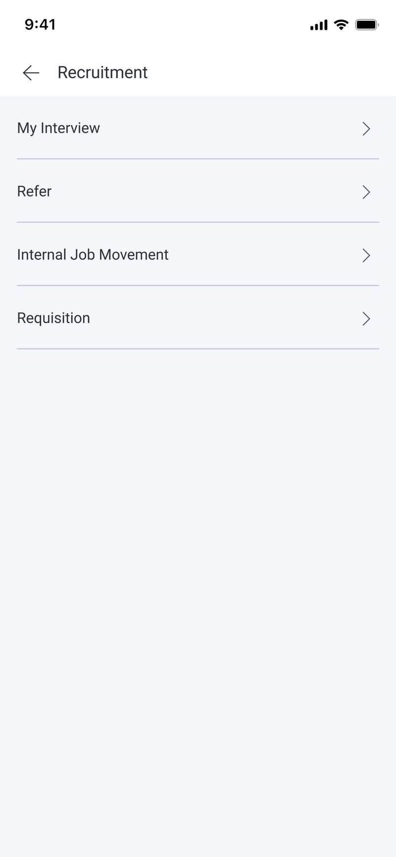
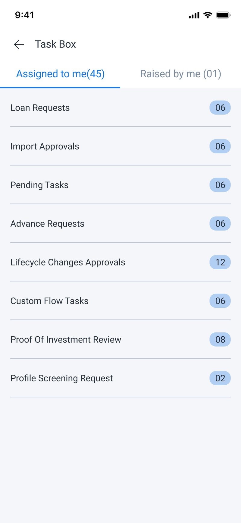
Before designing any screen I had to decide how people would reach these flows. Some go looking for recruitment. Most get handed a task and never think about recruitment at all. So which door a flow sits behind depends on who starts it, not on where it fits in the module.
The module
Work you set out to do. You open the app because you want to do this.
The Task Box
Work that lands on you. It shows up whether or not hiring was on your mind, next to loan approvals and investment proofs, because a hiring manager isn't a recruiter.
Raising a requisition.
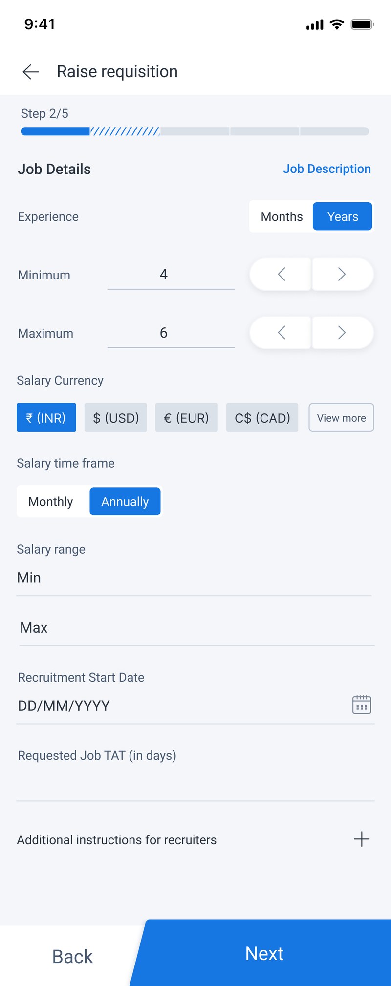
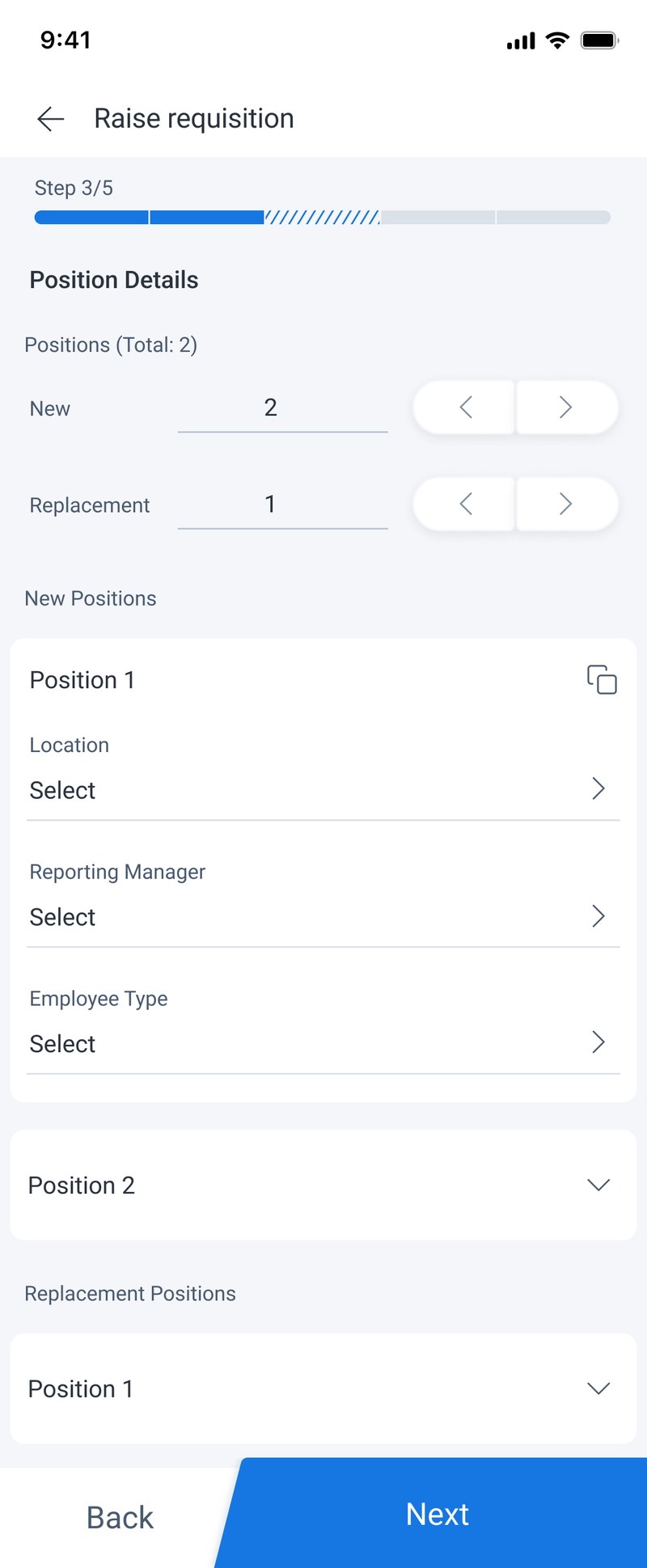
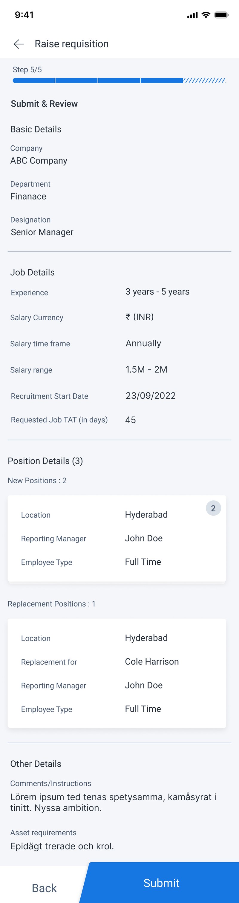
The desktop version is one dense form, which doesn't survive the move to a phone. So it becomes a five-step wizard, and wizards have a well-known problem: you can't see what you've filled in until you've committed to it.
The problem
A manager hiring three people was raising three requisitions, or one requisition and then asking someone to duplicate it. On a phone, filling the same five-step form three times is not a real option.
What I did, and what it bets on
Made the requisition an object that holds many positions, and typed each position as
new or replacement. Positions with identical specs collapse into one card
with a count badge. Replacements break out on their own, because they carry a field new
roles don't: Replacement for.
Betting that a manager thinks in terms of “I need three people on this team”, not
“I need to file three requests”. And that two identical new roles are one thing said
twice, so the form should only ask once.
How I'd check it held
Count positions per requisition after launch. If it stays at one, the object model was over-built and a manager really does think one request per head.
The problem
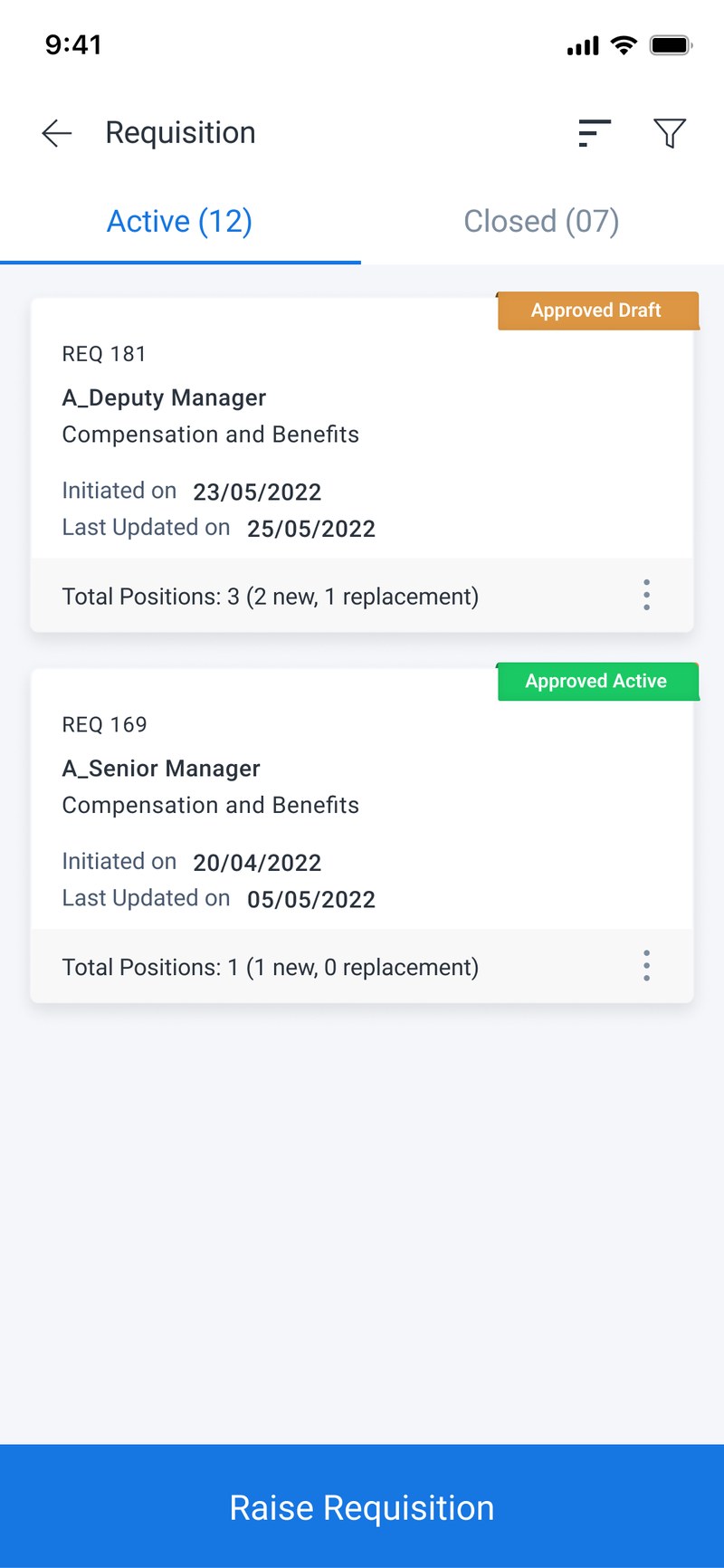
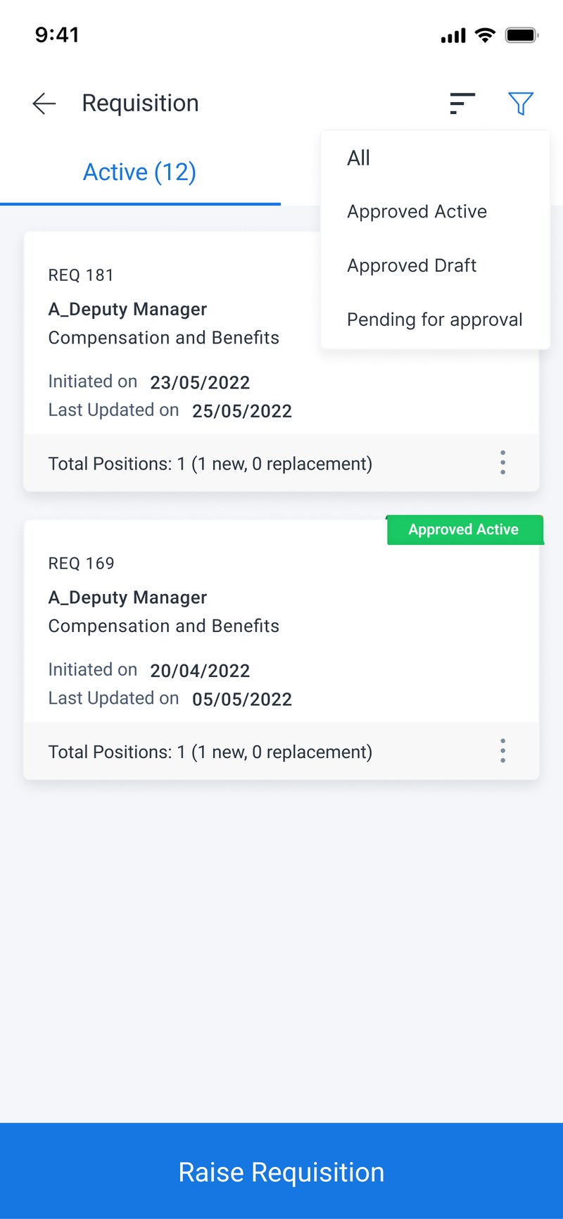
Once a requisition holds several positions, an approver looking at a list needs to know what kind of request it is before they open it. The desktop list buries that in a column.
What I did, and what it bets on
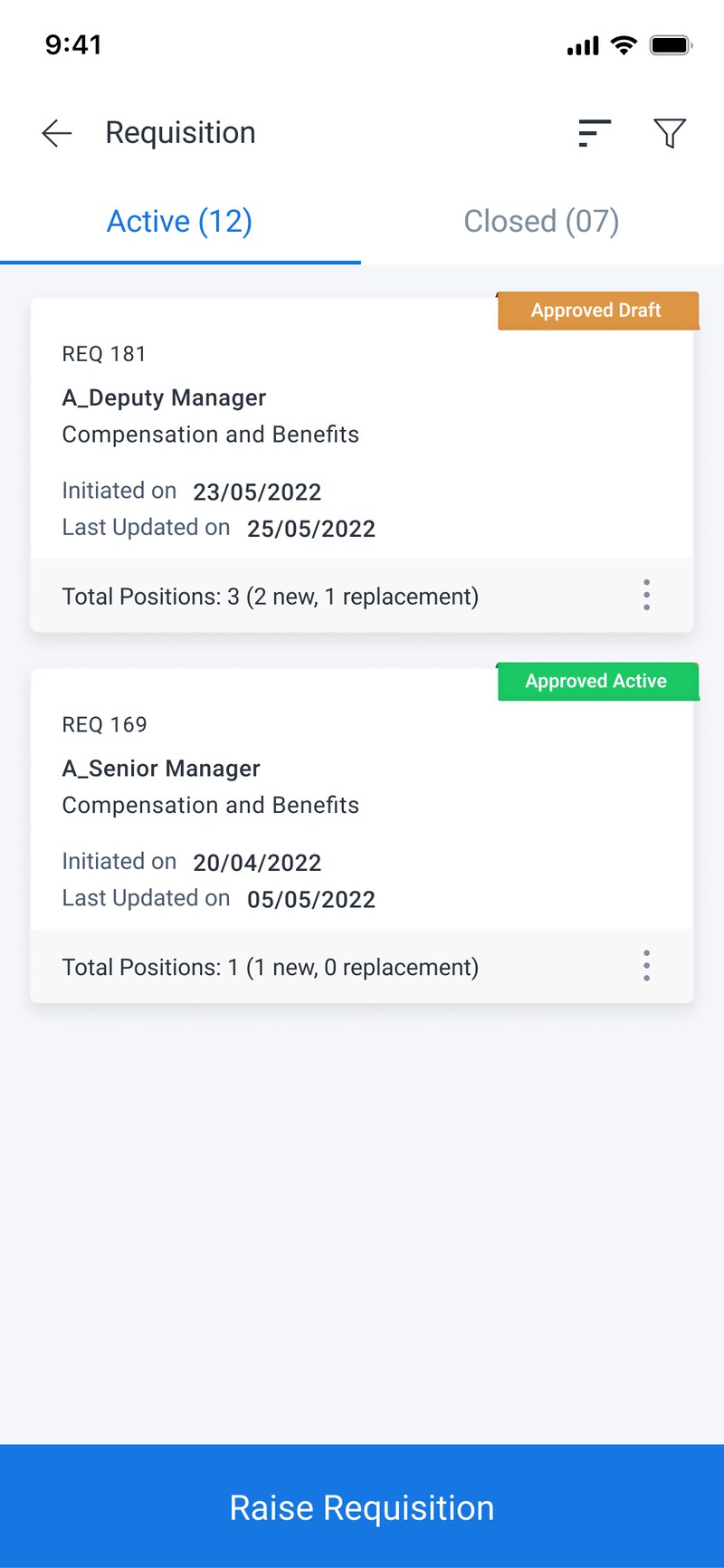
Led the list card with Total Positions: 3 (2 new, 1 replacement).
Betting that backfilling a role and adding headcount are politically different asks,
and that an approver triages on that distinction before anything else. On a phone there is
no column to bury it in, which turned out to be the better place for it on any screen.
How I'd check it held
Ask approvers to rank a set of requisitions by urgency, with and without the split showing.
The list, and how you narrow it.
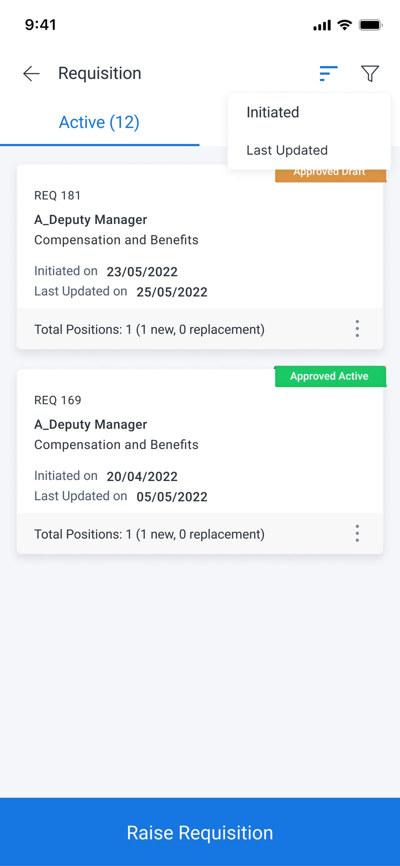
Twelve active requisitions is enough to need narrowing. Two tabs do the structural work, Active and Closed, and filter and sort sit behind the header for when you want them.
Screening in bulk.
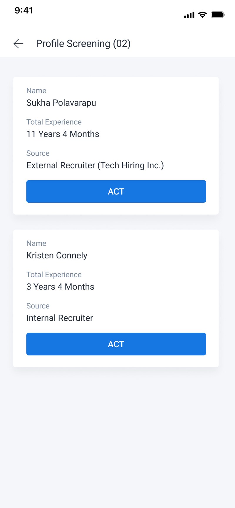
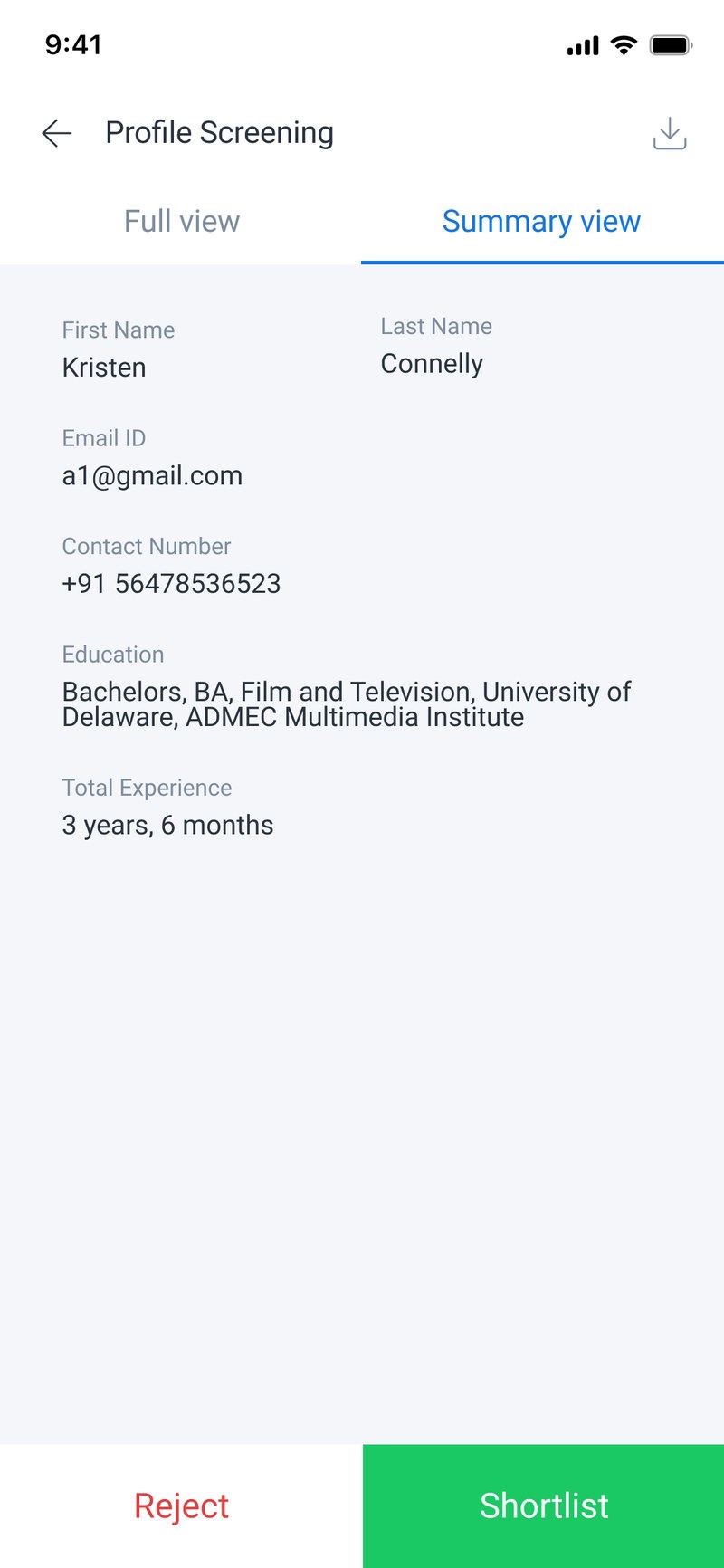
The second flow, and a different user. A recruiter works down a stack of applications, keeping or rejecting each one. The design problem is speed. The constraint is that rejecting somebody ends their candidacy, so the fast path can't make that careless.
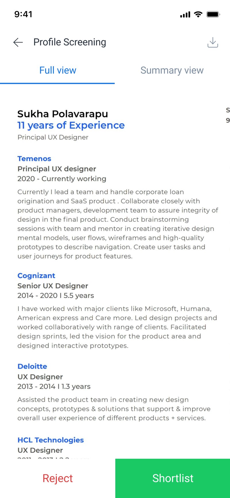
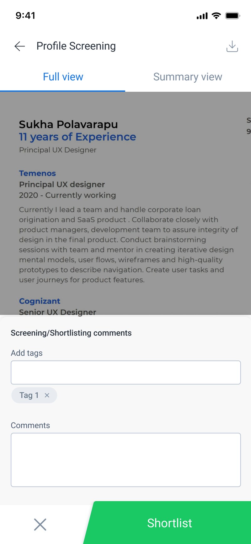
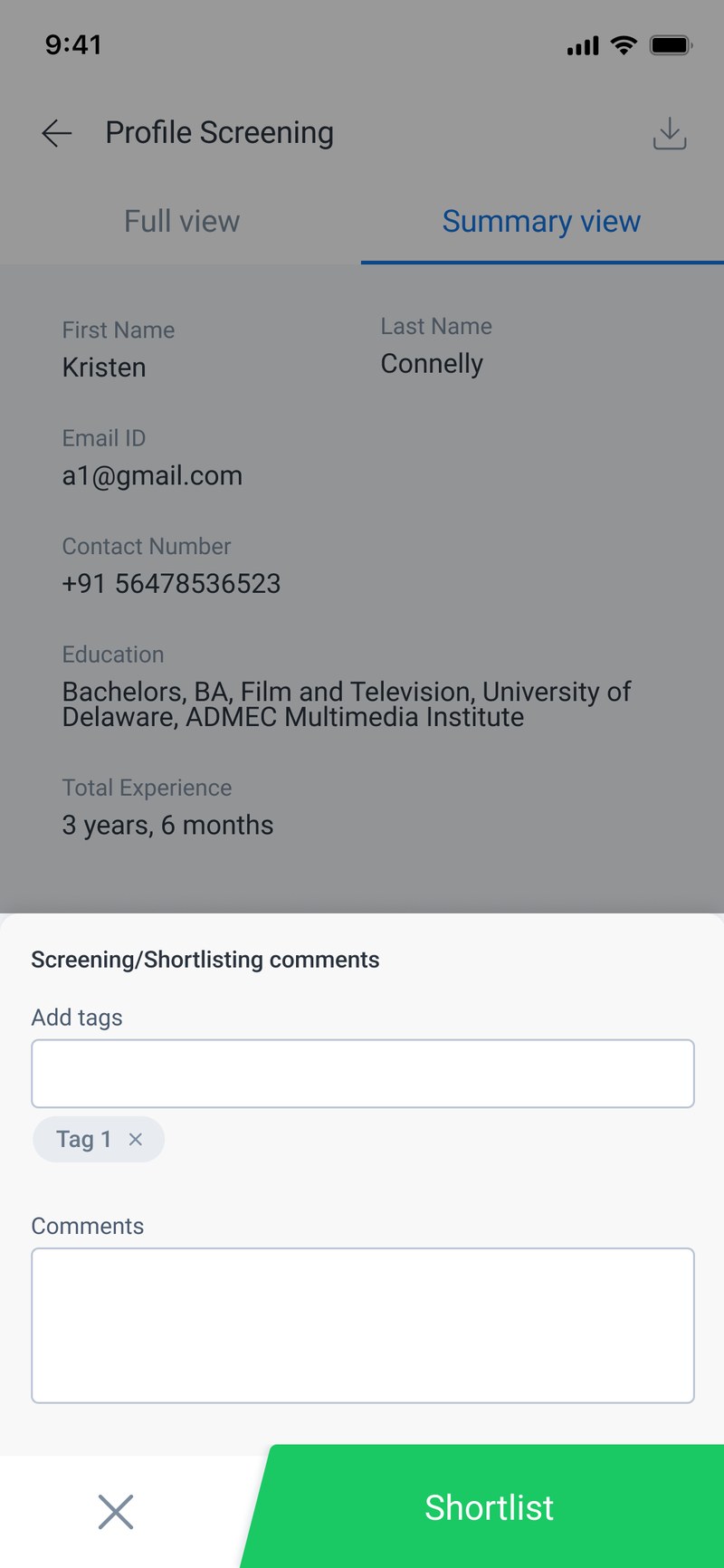
Rejection carries two brakes. It needs a moment of friction, so it isn't a reflex swipe, and it needs a reason attached, so the record says why. The comments screen holds the reason. The decision screen holds the friction. Everything else in the flow is built to be fast.
The toggle took four goes.
A résumé is a document you read. A screening decision needs a handful of structured fields. Both are true, they don't fit on one phone screen together, and how you move between them is where most of this design went.
 Grouped by opening
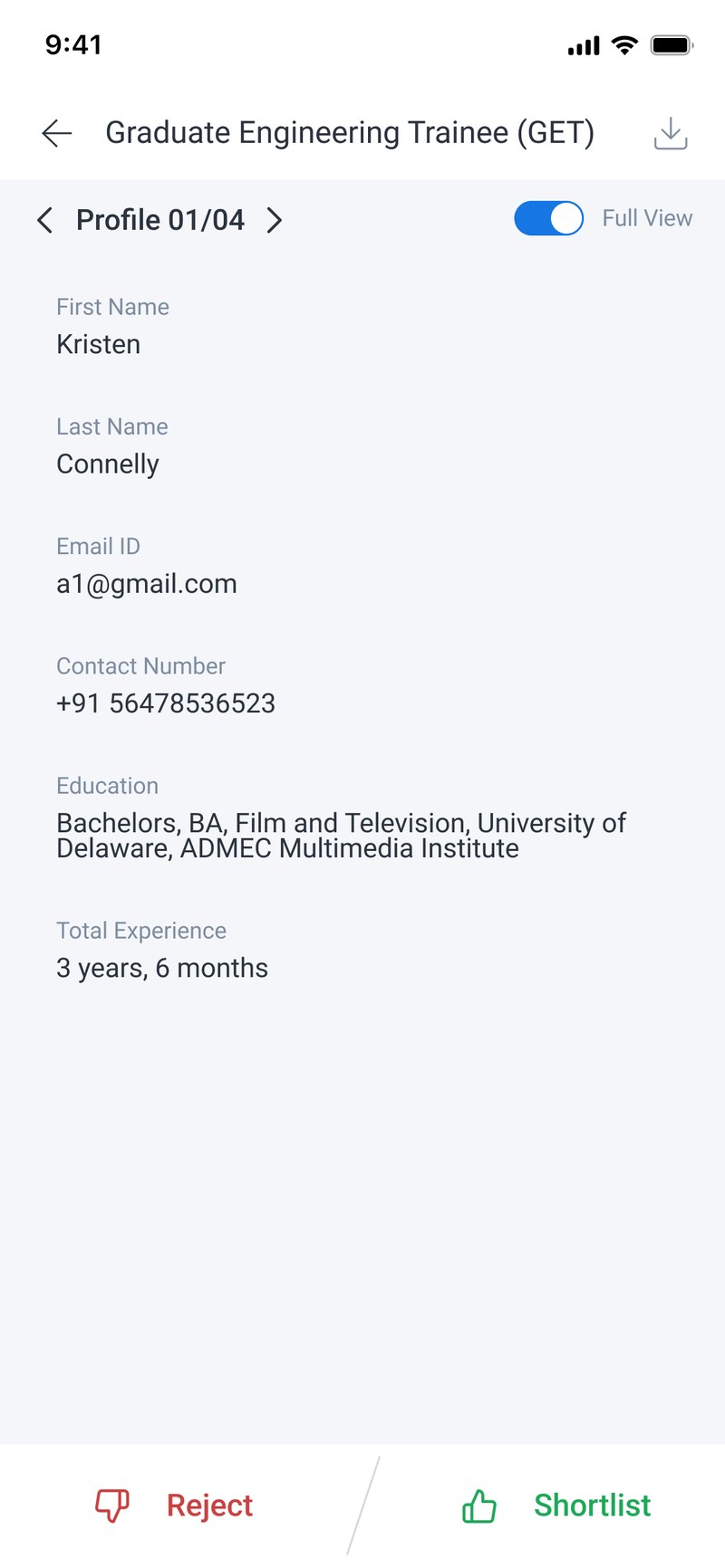 A single toggle
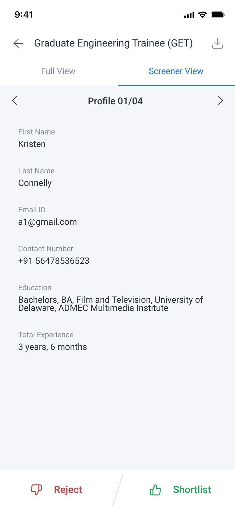 Named for the role
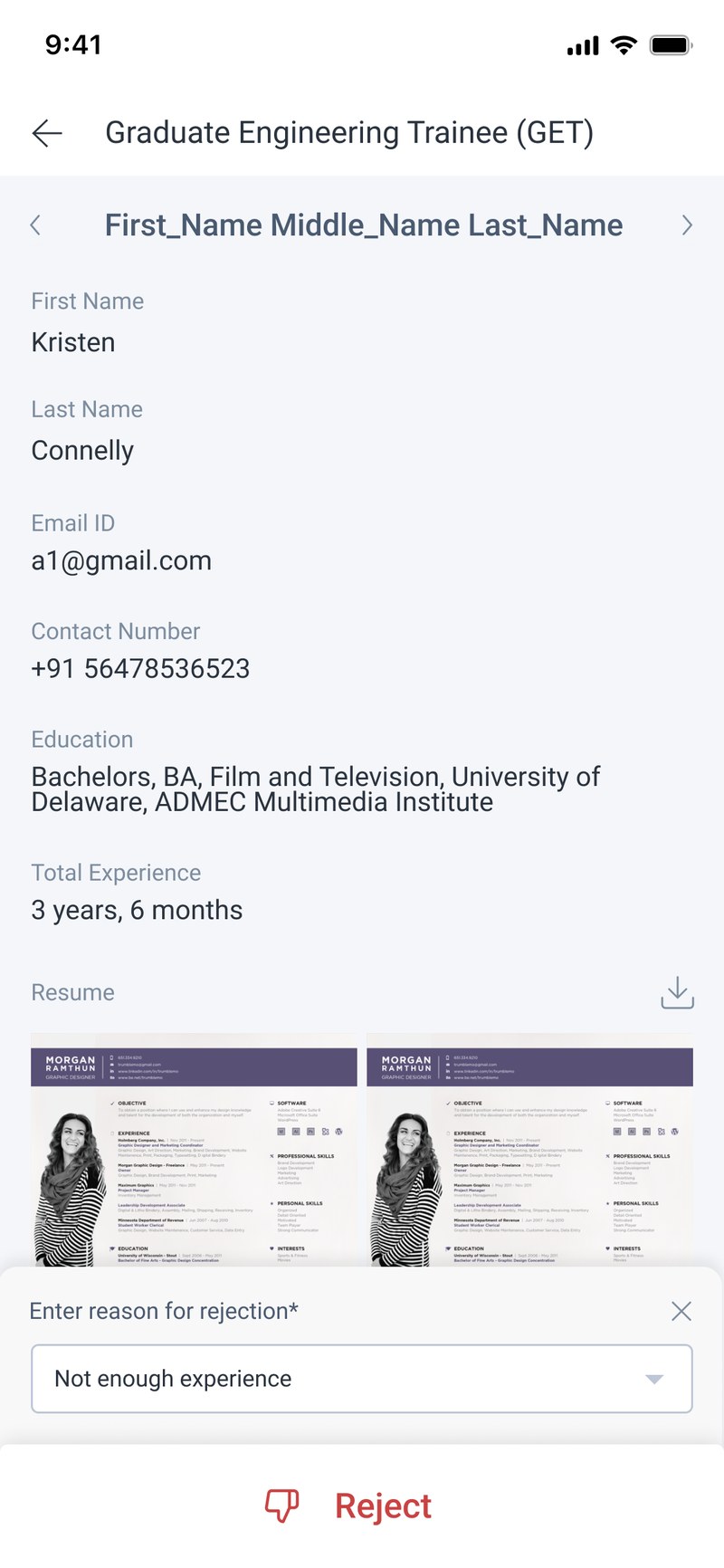 Paged by name
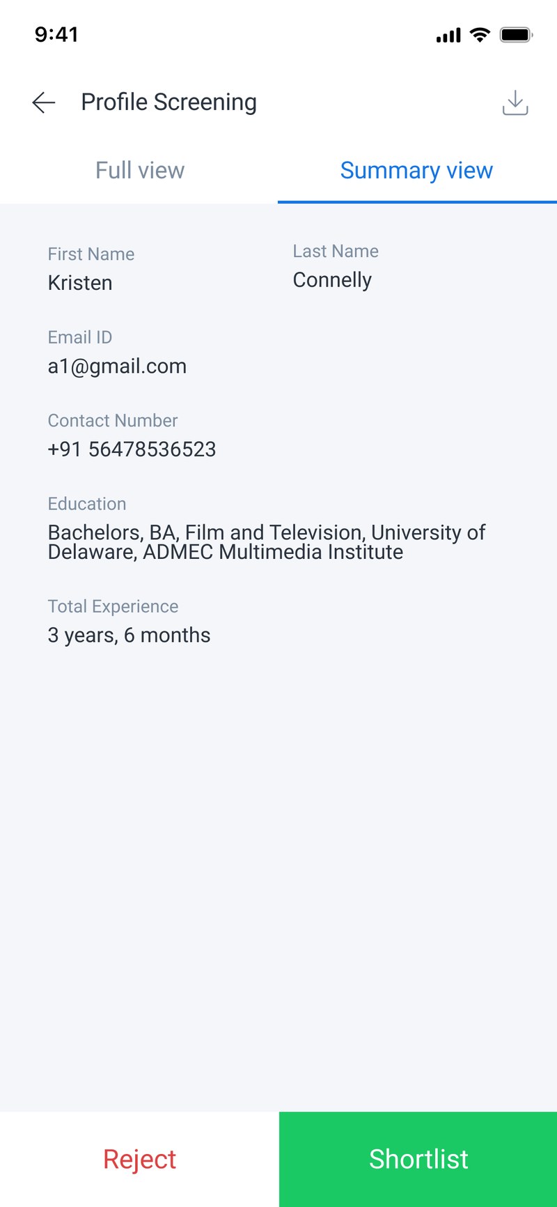 Two equal tabs
The problem
The document and the fields are two views of one candidate. A switch was the obvious control and I built it first.
What I did, and what it bets on
Replaced the switch with two tabs of equal weight.
Betting that people move back and forth between the document and the fields inside a
single decision, rather than picking one and staying there. A switch has an off position,
which quietly says one of these views is the real one.
How I'd check it held
Count switches per decision. If most sessions never move between the two, the tabs were wrong and a default view was right.
The review step is the detail screen. Step 5 of the wizard and the requisition detail screen are one component, so the wizard got a place to check your work at no extra build cost.
Two tabs, and both of them are places. Cut the filter sheet and the sort tabs for Active and Closed. Twelve requisitions a year does not need a filter engine.
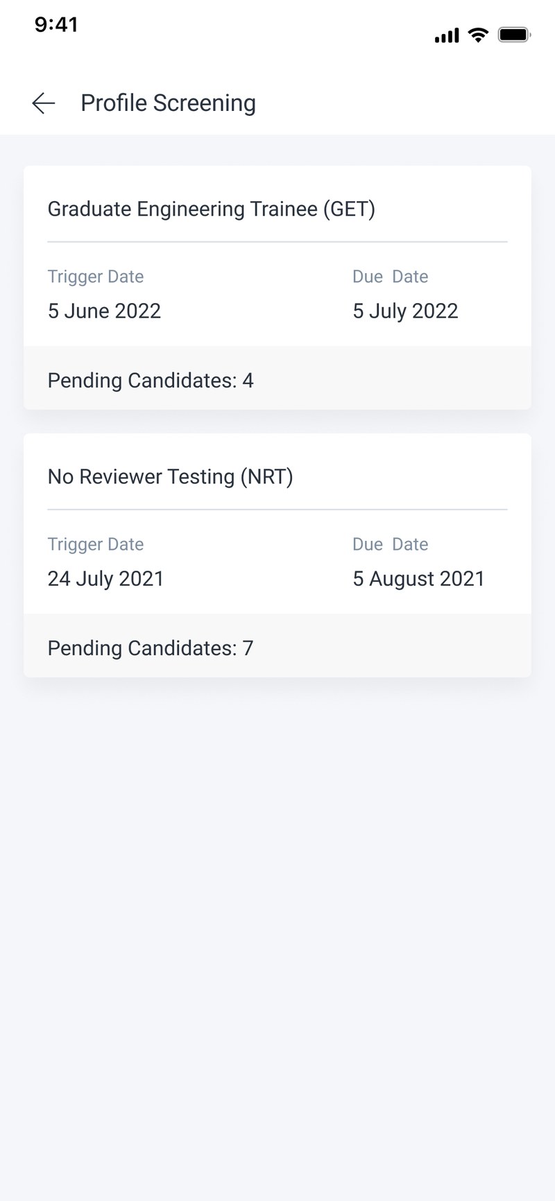
The queue is flat, and it leads with the source. Removed a level of nesting and spent the space on where the candidate came from, which is what changes how you read a résumé.
Named for its contents, not its user. “Screener View” became “Summary view”. A hiring manager arriving from a queue of loan approvals does not think of themselves as a screener.
No pager between candidates. A pager says there is a queue to get through. That is a recruiter's relationship to a shortlist, not a manager's.
The problem
A required dropdown makes people give a reason, but flattens it into one of a few categories.
What I did, and what it bets on
Replaced it with free text, plus tags.
Betting that a specific, honest reason is worth more to the next person who reads it
than a queryable one is to reporting. This is the decision I am least sure of, because it
trades something measurable for something I only think is true.
How I'd check it held
Read a sample of the free-text reasons and see whether they are richer than the dropdown was, or just emptier.
I worked inside the existing one.
Darwinbox already had a mobile design system and I used it. No new tokens, no new components, no colour scale of my own.
That's the right outcome, and worth saying plainly. In an enterprise product with a live system, inventing components mostly creates maintenance debt for someone else. What I contributed sits at the pattern level instead.
- The two-door entry model Work you start yourself lives in the module. Work assigned to you arrives in the Task Box. Where a flow sits depends on who triggers it.
- Coequal lens tabs, replacing a state switch Two views of the same thing should be tabs. A switch implies one of them is the normal state and the other isn't.
- Naming a lens by its content, not by its role Screener View became Summary view. A hiring manager doesn't think of themselves as a screener, so the tool shouldn't be named after the role.
- Review-step / detail-screen unification One component doing two jobs. It gave the wizard a place to check your work, and cost nothing, because the detail screen had to be built anyway.
What I'd do differently.
The five stage states are pending for scheduling, pending for interview, pending for feedback, pending for decision, and interview did not happen. All five sit in the middle and end of a hire. The two flows I shipped, raise a requisition and screen résumés, sit before all of them. Both were on the brief and both were the right size for the time, but the honest case for them is the mobile gap, not the stall states. The states point at panel feedback and manager decisions, and I built upstream of both.
Nine decisions, each with a stated bet, none of them checked with a user before release. Three unmoderated tests on the requisition wizard would have cost one day out of thirty. The first-click test written under decision 07 is one I should have run rather than described.
49 jobs-to-be-done across five roles, and the design served two. Mapping the candidate and the referrer made the blueprint sharper and it also took days. On a 30-day project I would still map all five and go deep on two, with the depth allocated at the start rather than at the end.
I replaced a required dropdown with free text because a fixed category flattens the reason. A required category with an optional note gets both the queryable field and the specific one. I framed a design choice as a constraint.
At the time I did not have a clear picture of how the requisition data was modelled, so status was the filter I reached for. The form already captures department, region, and the date each requisition was raised. Any of those would narrow a long list faster. I would start from the schema.