Designing MO, the anchor of a 12-app NextGenTV ecosystem for civic services, safety, local discovery, fundraising, and community participation.
I led a team of five designers on a 12-app ecosystem for NextGenTV, the broadcast standard that lets television carry data services alongside video. MO sat at the center: a TV-first launcher, shared profile, and community home surface. This page walks through the problems the living room created, the process that worked through them, and the decisions that answered them.
12connected apps
5designers led
TV-firstexperience strategy
CES 2024pitch support
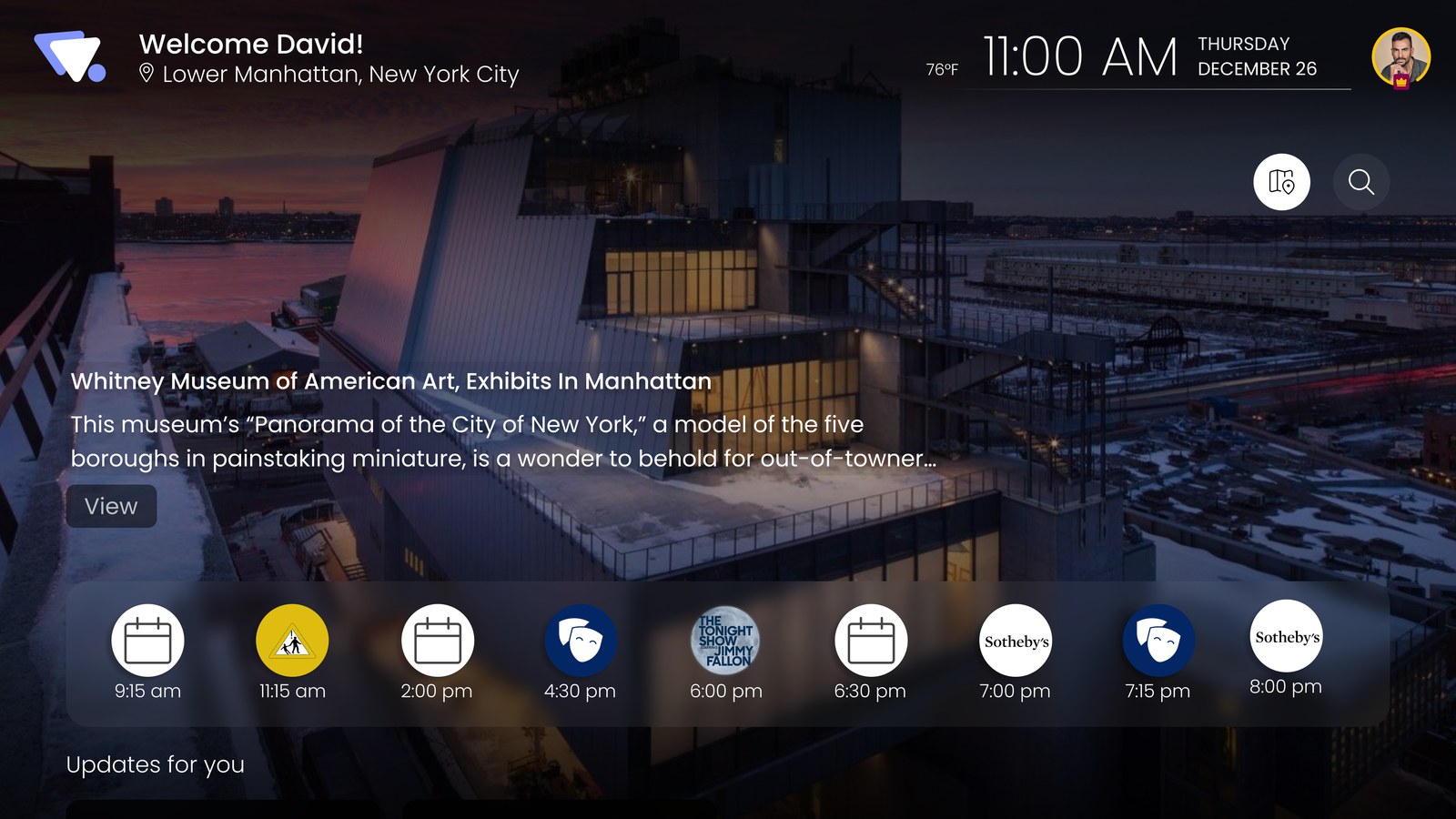
MO home · local awareness
The MO home surface. Local awareness leads, the ecosystem stays one focus-step away.
02Project Snapshot
The television as a local service layer
The project at a glance: what it was, who did it, and what it produced.
The ecosystem treated the television as a local service layer. A household could see what was happening around it, act on it, and carry recognition for participation across every app. The platform was built for taking part in the place you live.
The work supported a go-to-market joint venture between Mobius and Ark Multicasting and contributed design material to its CES 2024 pitch.
Role
Design Lead
Team
5 designers, within a larger cross-functional initiative
Scope
12 connected applications
Anchor
MO: launcher, profile hub, community home surface
Platforms
TV first; mobile, web, desktop as continuations
Technology
NextGenTV / ATSC 3.0 broadcast internet
Outcome
Ecosystem concept, TV-first design direction, shared profile and rewards model, CES 2024 pitch support
03Why Television, Why Now
Broadcast gained a data layer and a return path
Context for everything that follows: the capability shift that made a television ecosystem worth designing at all.
ATSC 3.0 lets a broadcast tower carry app data alongside video. One signal reaches every receiver in range at no per-user cost, and a broadband return path lets the television answer back. Each application in this ecosystem rode its own slice of that signal, which gave every app its own channel on the TV.
That was the argument for the television: reach without an install step, and zero per-user delivery cost.
Twelve app services ride the same broadcast signal, each on its own slice of bandwidth. The return path travels over broadband, so the screen can send as well as receive.
The most common screen in the home could now carry local services and answer back. The project question: what useful actions could people take through TV if it became aware of their community?
04The Three Problems
Three problems decided the shape of the work
This section defines what made the project hard. Each problem is drawn before it is described, and each one names the section of this page where it gets solved.
Problem 1 of 3
Distance and input: the couch is not a pocket
Phone · what civic services are built for
Distance
0.4 m · arm's length
Input
Full keyboard · typing is cheap
Audience
One person · personal data is safe on screen
Television · what this platform provides
Distance
3 m · across the room
Input
5 keys · up, down, left, right, select
Audience
The household · everything on screen is shared
Civic and emergency services are designed for the left column. This platform only had the right one. Every flow in the ecosystem had to survive that translation.Solved in 06 · Rules for the ten-foot screenProblem 2 of 3
Twelve apps, twelve channels, no whole
Each app rode its own broadcast slice, so each arrived on the television as its own channel. The architecture guaranteed access. It also guaranteed fragmentation.
CH 01MO
CH 02C-Link / 311
CH 03VoteIQ
CH 04Around
CH 05Aegis
CH 06GoFEMA
CH 07AmplyFund
CH 08Hear Here
CH 09iZak
CH 10Local Ads
CH 11Arts & Culture
CH 12Local Business
12profiles
12alert feeds
12point ledgers
0views of the whole
Twelve channels, one screen: every channel carries its own profile ●, alert feed ▲, and point ledger ◆, duplicated twelve times with no view of the whole. Even the launcher only launched.Solved in 07 · The anchor decision: what MO ownsProblem 3 of 3
Many tones, one platform
An emergency app must carry urgency without panic. A fundraising app must feel warm. A civic app must feel accountable. Twelve products across seven domains needed different emotional registers, and the set still had to read as one ecosystem on one screen.
Tone had to vary by product. The foundation underneath could not. The design question was where exactly to draw that line, and who enforces it.Solved in 09 · One foundation, many identities
05The Process
How the work ran, from platform to pitch
The UX process, stated honestly. This was concept-to-pitch work inside a larger cross-functional initiative, so a tight working loop stood in for a formal research program.
Direction came from three inputs: what the broadcast platform could actually do, published TV design guidance from the major platforms, and recurring working reviews with the venture's stakeholders. Every design decision on this page traces back to one of those three.
0102030405
Phase 1
Ground
Understand the platform's real constraints. Study published TV design guidance. Frame the three problems.
The interaction rules every app in the ecosystem had to follow. Android TV guidance was the base, checked against tvOS and Fire TV patterns, then adapted for civic, emergency, and community use.
Remote-first navigation
Every primary action is reachable with up, down, left, right, and select. No pointer, no gestures, no exceptions.
Visible focus
Focus states are oversized and luminous, readable from the couch without hunting for a cursor.
Ten-foot readability
Type scale, spacing, and card sizes are set from a living-room viewing distance.
Low-saturation surfaces
Cool, dark surfaces sit in a living room without glare.
Overscan-safe margins
Televisions crop the frame edge. Nothing critical lives in the outer margin.
Fewer steps when it matters
Civic and emergency flows compress to the shortest possible path. Comprehension first, action next.
Shared-screen privacy
The TV is a household screen. Personal detail stays off it and continues on the phone.
Cross-device continuity
The TV starts a task; deeper steps continue on the phone, web, or desktop without losing the thread.
Grounded in Android TV's Design for TV guidance, the Apple tvOS Human Interface Guidelines, and Amazon Fire TV design guidance, adapted for utility, civic, emergency, and community use.
The single architecture decision that defined MO: not a portal the apps live inside, but the layer they share.
A standalone channel per app was a property of the broadcast architecture, so a hub could never be the only door. MO was designed as what the standalone apps share instead: one profile, one reward record, one local-awareness feed, one place the ecosystem is visible as a whole. An app opened from its own channel still works alone. The same app opened through MO arrives with identity, context, and recognition attached.
The decision came down to what the center owns. Four things:
IdentityOne profile, shared by every app.
AwarenessOne alert feed for the neighborhood.
RecognitionOne reward ledger across the ecosystem.
PassageOne continuation path off the television: deeper tasks move to phone, web, or desktop.
Every app keeps its own channel, marked by the antenna arrows. The duplicated profile ●, alerts ▲, and points ◆ from every channel now exist once, at the center. Twelve applications, one whole. Passage is the fourth own: the center also holds the one continuation path off the television.
The business proposition was direct: MO is the landing surface of the television, the super app the rest of the ecosystem opens from. Institutions publish alerts, services, causes, and offers into the platform, and the household meets all of it on MO first.
08The MO Surface
The home screen, decision by decision
The core MO surface I designed, shown as it evolved: the pass that failed, the pass that shipped, and the calls that separate them.
Pass 1 · rejected in review · redrawn from working files
Why it failed: it read like every streaming launcher. Apps owned the surface, the local advisory was a footnote, and nothing signalled that this television knew its neighborhood.
Pass 2 · shipped direction
What changed: local awareness took the lead position, the ecosystem moved to a rail one focus-step away, and the profile became visible on the home surface. Familiar enough to navigate, different enough to signal this is not another streaming home.
MO home · local awareness
HierarchyLocal awareness leads. Alerts, advisories, and events surface before apps.
PassageEcosystem entry stays one focus-step away, never buried in menus.
LegibilityStatus reads at three meters: high contrast on a low-saturation surface.
Safe areaCritical content respects the overscan margin.
Where tasks finish
The TV starts tasks. The phone, web, and desktop finish them.
Every app kept its voice. Every app kept the rules.
How twelve products held together without looking identical, and how five designers worked in parallel without drifting apart.
The split was explicit. Everything that makes a TV usable was shared and non-negotiable. Tone, color, and typographic voice stayed local to each app. The per-app style guides below are the artifact of that split, and they are what made parallel work across the team possible: a designer could move fast inside their app because the foundation was already settled.
Shared · the foundation
Owned centrally. No app may override these.
Focus model and remote navigation
Overscan safe areas
Type-scale logic for ten feet
Profile and identity hooks
Reward and recognition hooks
Local · each identity
Owned by each app's designer.
Typeface
Palette
Voice and tone
Imagery
Emotional register
Typography and color, per app
Select a card to see its component snapshot.
MO
Launcher, profile, community home surface
Urbanist
Heading · 40Around you tonight
Sub · 18Your community, at a glance
Body · 16Alerts, services, and events from the neighborhood.
PeriwinkleSageBone
MO
Component snapshot
Alert moduleChannel railProfile cardFocus ring
SCREEN NOT YET SOURCED
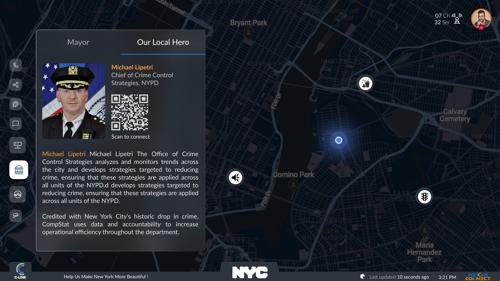
C-Link / 311
Civic reporting and service tracking
Lato
Heading · 40Report an issue
Sub · 18Service requests near you
Body · 16Track a report's status from the television.
Civic BlueInkSlateCloud
C-Link / 311
Component snapshot
Report formStatus trackerCategory tileMap pin
SCREEN NOT YET SOURCED
VoteIQ
Elections and civic information
SF Pro
Heading · 40Election day
Sub · 18Find your polling place
Body · 16Ballot information for your district.
Vote BlueVote RedInkCloud
VoteIQ
Component snapshot
Ballot cardPolling locatorRace listCountdown
SCREEN NOT YET SOURCED
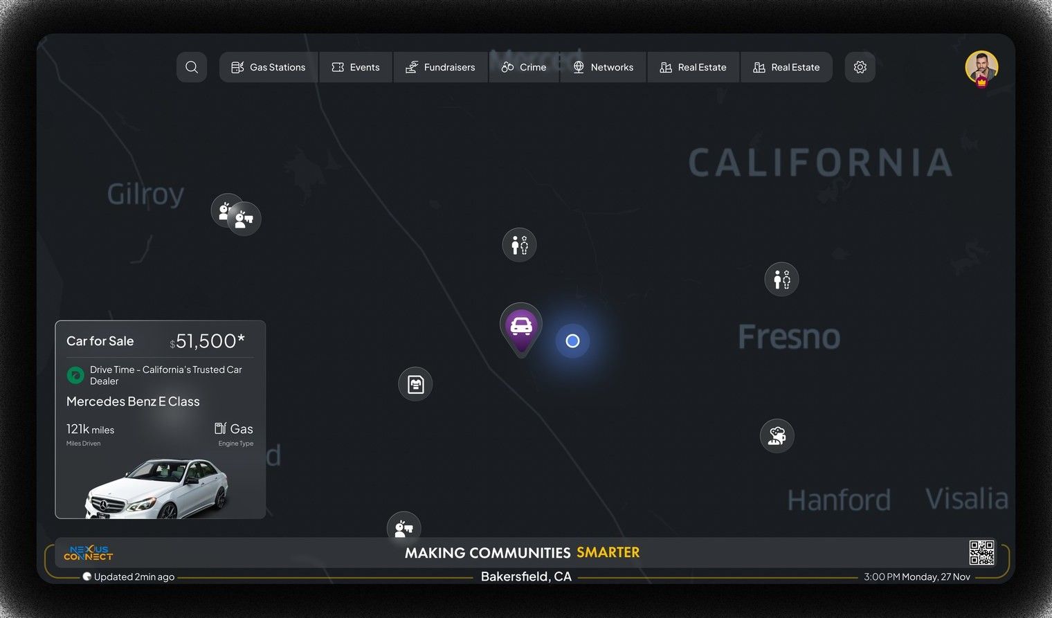
Around
Hyperlocal maps and live conditions
Inter
Heading · 40Live local map
Sub · 18Roads, weather, and conditions
Body · 16What is moving around you right now.
Around
Component snapshot
Map surfaceCondition chipPlace cardDistance rail
SCREEN NOT YET SOURCED
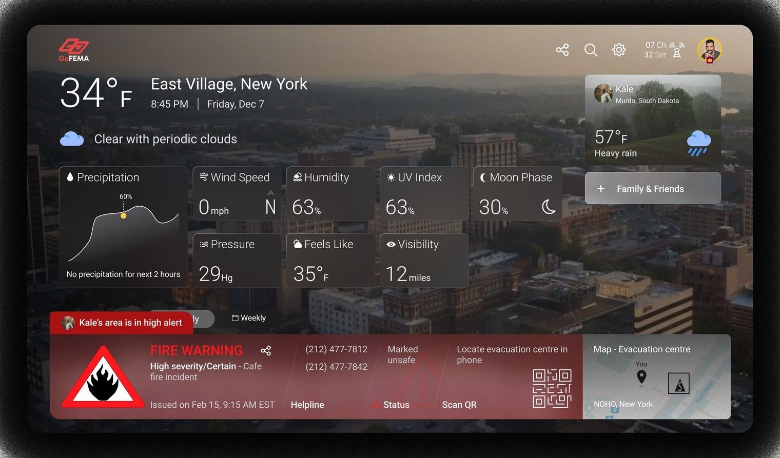
Aegis / GoFEMA
Emergency communication and response
Archivo
Heading · 40Shelter locations
Sub · 18Alerts for your area
Body · 16Safety resources, stated clearly and calmly.
Aegis / GoFEMA
Component snapshot
Alert bannerShelter cardChecklistStatus strip
SCREEN NOT YET SOURCED
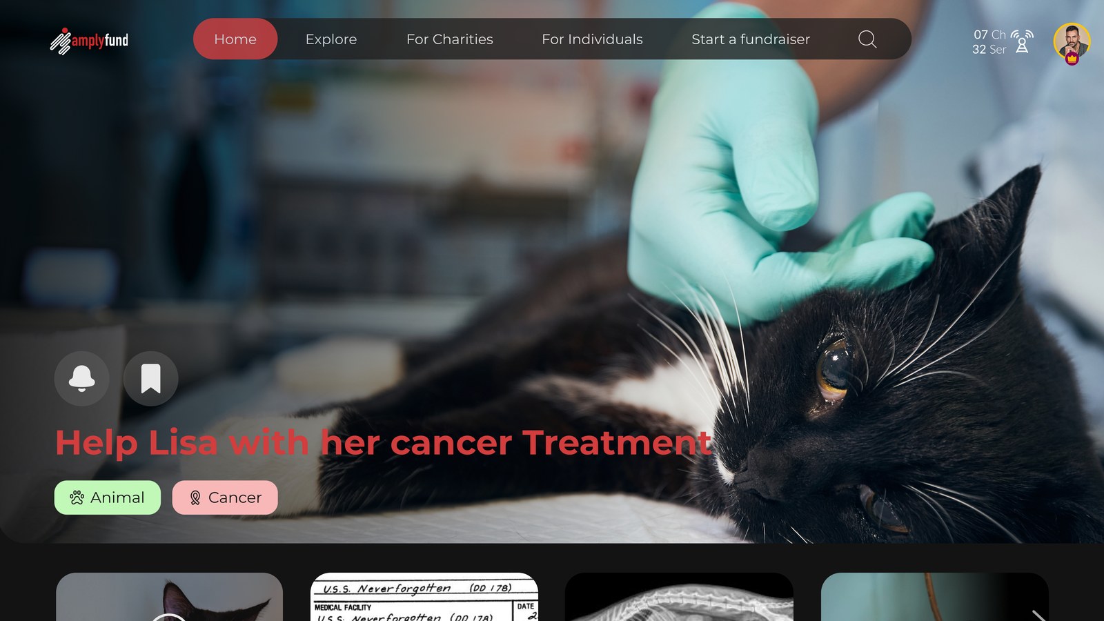
AmplyFund
Local causes, giving, volunteering
Montserrat
Heading · 40Support a local cause
Sub · 18Neighbors helping neighbors
Body · 16Donate, volunteer, and follow the impact.
Signal RedImpact GreenInkCloud
AmplyFund
Component snapshot
Cause cardProgress barDonation tileImpact stat
SCREEN NOT YET SOURCED
Hear Here
Local discovery and NextGen radio
Sora
Heading · 40Discover nearby
Sub · 18Events, culture, and local radio
Body · 16What is on around the corner tonight.
Hear Here
Component snapshot
Now-playing barStation listWaveformQueue row
SCREEN NOT YET SOURCED
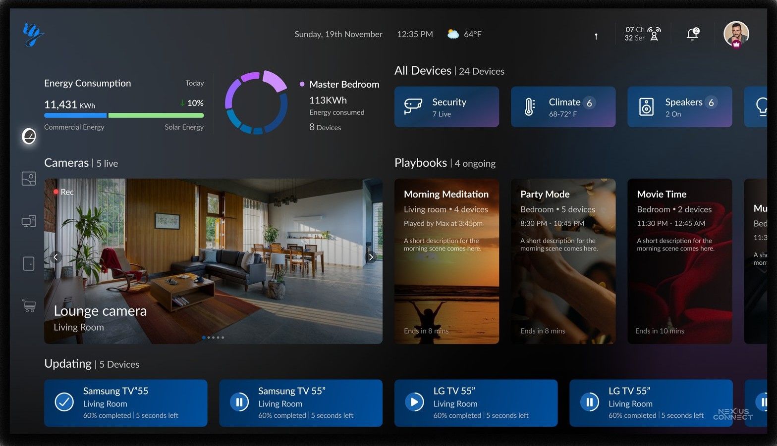
iZak
Smart living and energy behavior
Space Grotesk
Heading · 40Home energy
Sub · 18Use less, see it add up
Body · 16Household intelligence across your devices.
iZak
Component snapshot
Device tileEnergy chartAutomation rowSavings stat
SCREEN NOT YET SOURCED
Six of the twelve
Representative products, each with the problem it carried and its route back to MO.
C-Link / 311
C-Link / 311
Make civic reporting simple for residents while supporting the crews who resolve it.
Through MO: issue prompts and status updates
Around
Around
Show rich local context on a TV without overloading the screen.
Through MO: the local awareness layer
Aegis / GoFEMA
Aegis / GoFEMA
Communicate urgency without panic, and help people act with confidence.
Through MO: alerts and response entry points
AmplyFund
AmplyFund
Build trust and emotional clarity around giving.
Through MO: causes as participation opportunities
Hear Here
Hear Here
Make local discovery easy to navigate from the couch.
Through MO: discovery on the home surface
iZak
iZak
Make household intelligence readable across devices.
Through MO: energy behavior feeds recognition
10Community Reputation
Recognition that maps to a neighborhood's benefit
The behavioral layer: which incentives the ecosystem uses, which it refuses, and how recognition earned in any app rolls up into one identity.
Octalysis was the basis for defining gamification across the ecosystem. Its eight core drivers sit at fixed positions on an octagon, and the position carries meaning. The top half holds drivers that feel good to act on, the bottom half holds drivers that work through pressure. The left side is external reward, the right side is internal motivation.
The framework · 8 drivers
All eight drivers
Each driver, with its meaning read at the node.
Used · 5 drivers
What we used
Five drivers shaped the model. All five sit in the top half.
Epic Meaning & Calling
Rewards attach to civic actions: reporting, donating, conserving, turning up.
Empowerment of Creativity
Quests suggest a next action. None are required, and skipping one costs nothing.
Social Influence & Relatedness
Ambassador status sits on the profile card, visible to everyone at the television.
Ownership & Possession
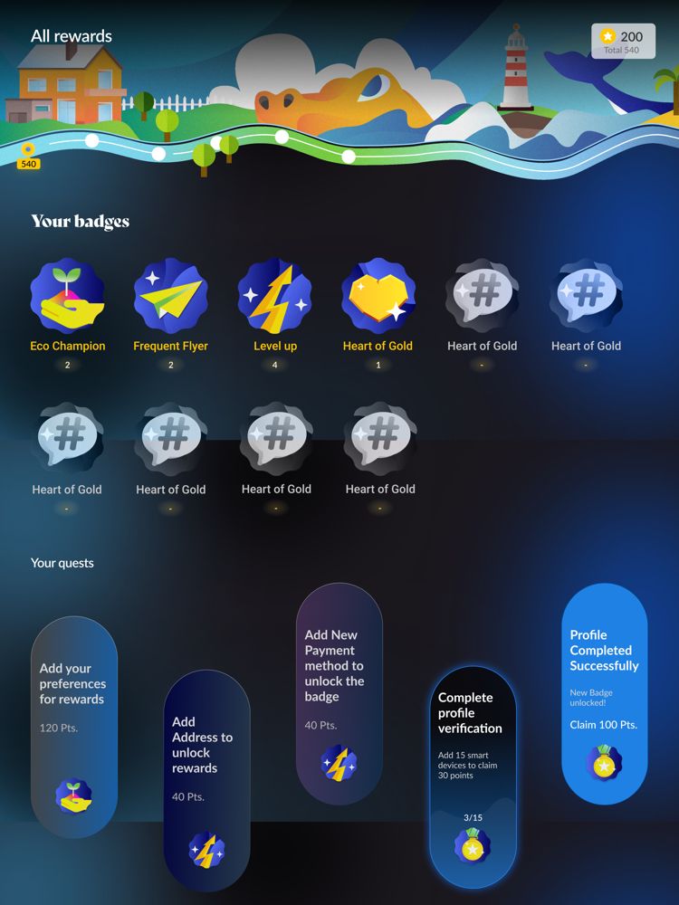
A badge shelf on the profile: earned badges in color, unearned ones locked in the same grid.
Development & Accomplishment
Level 12 with a progress path along the rewards screen, and a running DoGooder Points total.
Refused · 3 drivers
What we refused
Three drivers were available and left out. All three sit in the bottom half.
Unpredictability & Curiosity
Random reward schedules drive compulsive checking. Every reward here states its condition in advance.
Loss & Avoidance
Streaks and decaying points punish absence. Civic participation is voluntary, and stopping costs nothing.
Scarcity & Impatience
Countdowns force urgency onto actions that should stay open. No civic action here expires.
Accomplishment
Level progress and a running point total, sized for a television. Progress is stated, and no part of it decays.
Rewards screen. Progress path along the top, badge shelf below it, quests at the bottom. Earned badges carry color, unearned ones stay locked in the same grid, which is the ownership driver made visible. No countdowns, no streaks, no penalty for stopping.
Ownership and social influence
One profile holds everything earned anywhere in the ecosystem. Standing is visible on the card itself.
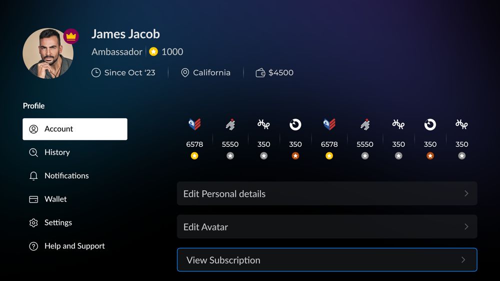
Profile, list treatment. Ambassador status and the point total sit in the header. Per-app tallies run in a row beneath it.
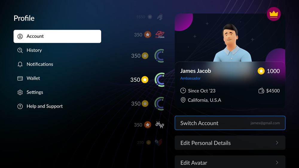
Profile, card treatment. The same content with the member card given weight and tallies along a curve. Both keep identity, standing, and points in one frame.
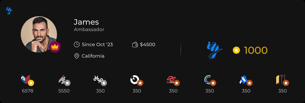
Per-app tallies in detail. Each ecosystem app keeps its own count, and the sum sits beside the member name. This is the recognition own from section 07 in its shipped form.
One television, several people
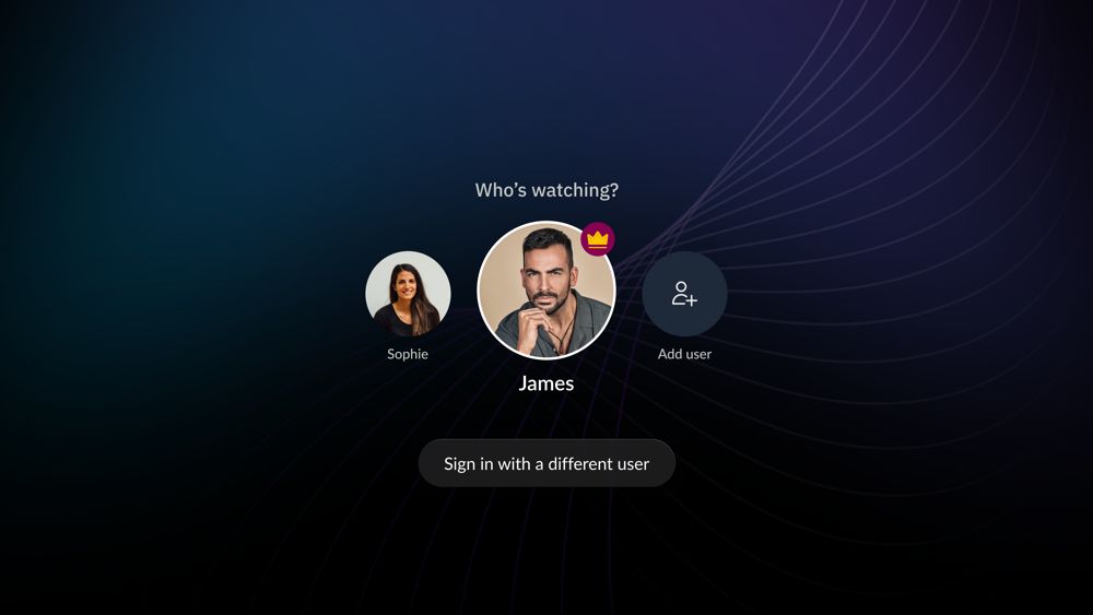
Reputation attaches to a person, and a television is shared. Profile selection runs before any of it.
Profile selection. Points, badges, and standing belong to whoever is signed in, so the household picks a profile first. Without this screen, one person's civic record would absorb the whole household's activity.
Exploration, not the shipped set
Badge naming and illustration were explored separately from the incentive model. The names visible in these frames come from that exploration and were not settled.
The award moment was tested at television scale: one badge filling the screen, legible across a room, with the reason stated in a single line underneath.
Recognition extends past the screen. A consistent record of participation could qualify for perks from local businesses. That link is what makes the refusals load-bearing: a reputation with real-world value has to be earned through contribution. Pressure to keep a streak alive would earn the same standing for the wrong reason.
11Outcome and Reflection
What the work delivered
The concrete outputs, stated without inflation, and what the project changed in how I design.
Ecosystem conceptTwelve connected applications with defined roles and one anchor.
TV-first directionAn interaction foundation every app followed, grounded in platform guidance.
MOLauncher, shared profile, and community home surface at the center.
Per-app systemsEight style guides holding separate identities to one foundation.
Reputation modelA cross-app recognition layer mapped to community benefit.
CES 2024 pitch supportDesign material for the venture's pitch on community services over broadcast spectrum. Pitch support is the stated outcome; no commercial launch is claimed.
Coherence in a single app is flows, components, and consistency. Coherence in an ecosystem is shared identity, shared value exchange, and a reason for each product to exist inside the system.
The hard part of this work was holding twelve products to one foundation while each kept its own tone. The leadership work was that reconciliation. It changed what I check first in any multi-product problem: who owns identity, where recognition lives, and what the center is allowed to own.