UX Case Study · Darwinbox
Organisation
View.
Rebuilding Darwinbox's org chart for mobile: one person in focus, with their manager, peers and direct reports one tap away.
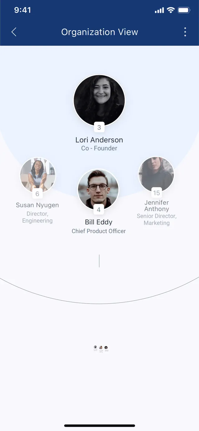
Darwinbox's mobile org chart was a desktop tree scaled down. I rebuilt it around a single focused person (manager above, direct reports below, peers either side), with contact actions on every node.
01 The Problem
What people come here to do
People open Organisation View with a specific colleague in mind. The old view was built to display structure; it answered none of the three questions they actually arrive with.
The Reframe
Two ways to structure the view
Structure
Dotted lines don't fit
in a tree.
Reporting lines form a tree. The relationships people actually need (matrixed teams, dual managers, cross-functional partners) form a graph. Navigation that only moves up and down can't reach half of it, which is why sideways movement between peers is a core direction here.
02 Constraints
What the design had to work within
Rendering the whole org isn't viable
Customer orgs run to tens of thousands of people. There is no zoom level on a phone where the full structure stays legible.
Every customer org is a different shape
Darwinbox serves hundreds of companies: some flat, some fifteen levels deep. No layout could be hand-composed per client.
Reporting lines aren't the whole picture
Dotted-line reports, matrixed teams and dual managers are common in enterprise orgs.
Contact data is sensitive
Personal phone numbers, office location and emergency contacts sit behind these profiles. They can't be one tap from every employee.
help someone find a colleague, see who they work with, and contact them, without rendering the whole org?
03 Exploration
Three directions on the table
Redesign the tree for touch
Better pan and pinch, plus a mini-map to hold position.
A flat, searchable directory
Drop the structure. Search a name, open a profile.
Focus + context
One person in full, with their immediate neighbours tappable.
04 The Solution
One person in focus.
Up, down, sideways.
Promotion
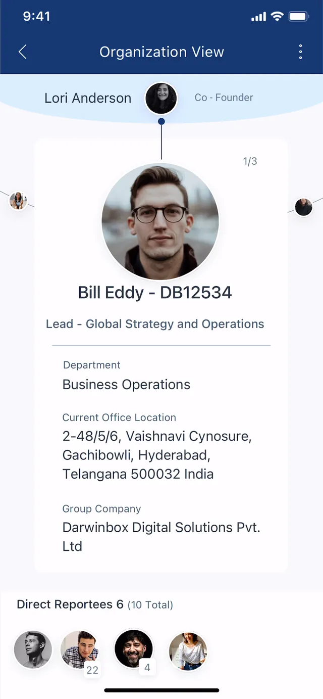
Each screen centres one person and draws only their direct edges. Tapping a neighbour animates them into the centre and rebuilds the surrounding set. The animation is what keeps people oriented; a hard cut between two similar screens leaves no trace of how you got there.
Peer navigation is a first-class direction. Swipe left or right to move between people who share a manager. The 1 / 3 counter and the partial avatars at each screen edge indicate the peers exist.
The model
Walk it yourself
The navigation model, stripped to its bones. Tap any node, or a name in the trail. Up to a manager, down to a report, sideways to a peer. The breadcrumb shows where you are; the animation shows how you got there.
Focused on Bill Eddy · Chief Product Officer. Reachable from here: manager, 3 reports, 2 peers.
Tap a node, or a name in the trail
Try it
The prototype, running
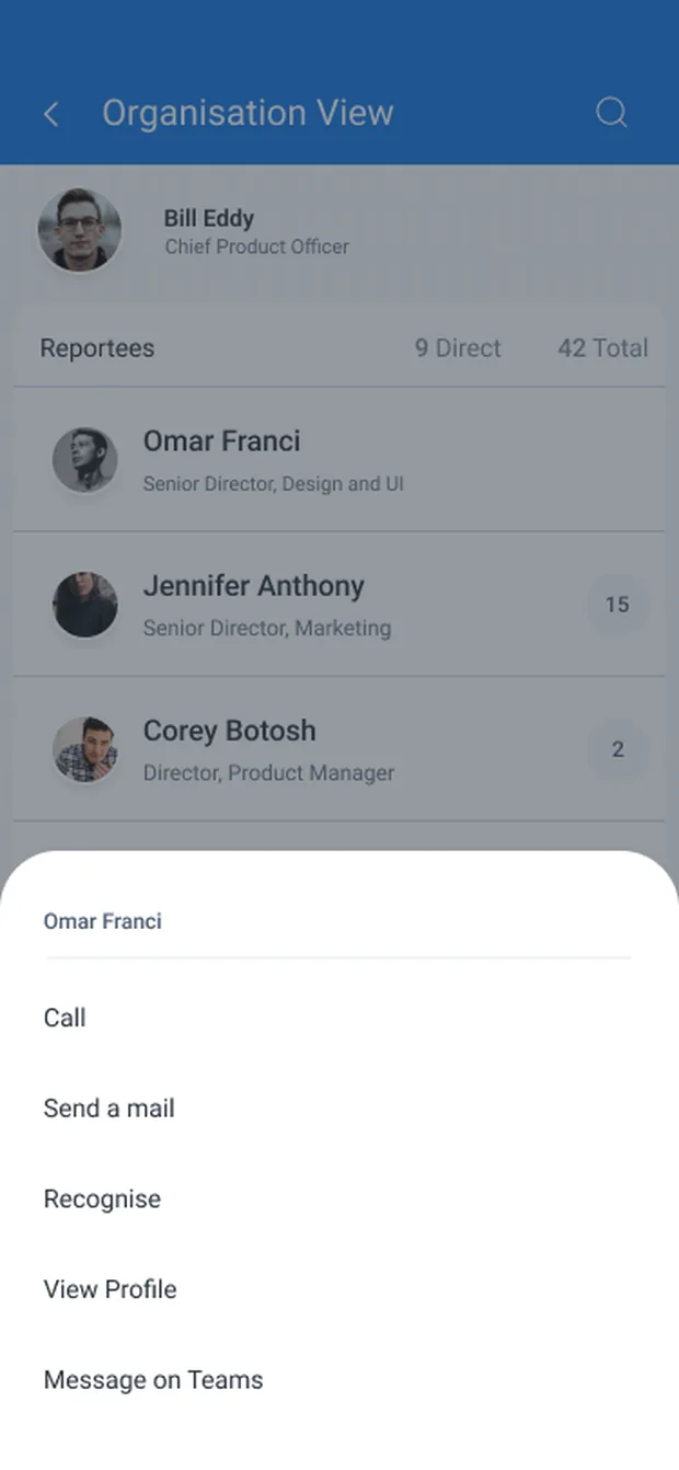
The real screens, wired together. Tap Org. view, then scroll: the header collapses and the focused person pins to the top. Tap a reportee for the action sheet. Every tap is drawn where it lands.
Keeping your bearings
The structure, redrawn for the phone
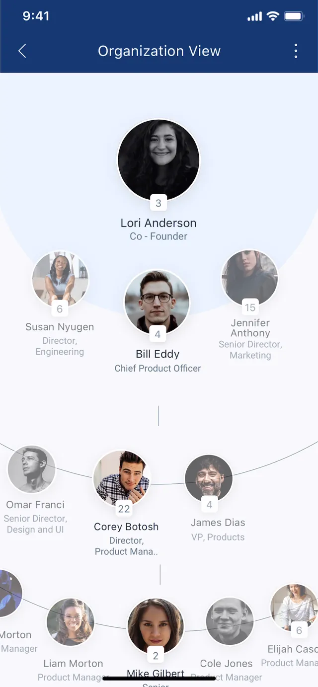
Connectors fan top to bottom, so moving down the hierarchy uses vertical scroll rather than pan and pinch.
A number means the person has reports; no badge means no team beneath them. It tells you whether tapping will open anything before you tap.
Keeping your place
The person you are inside never scrolls away
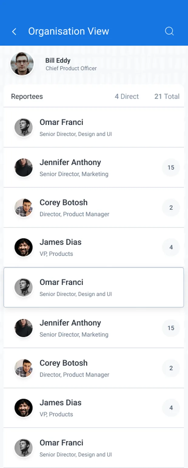
Descending into a team means scrolling a list that can run to dozens of people. As the list moves, the focused person collapses from a full header into a compact pinned row, so the answer to "whose team am I looking at" stays on screen the whole way down.
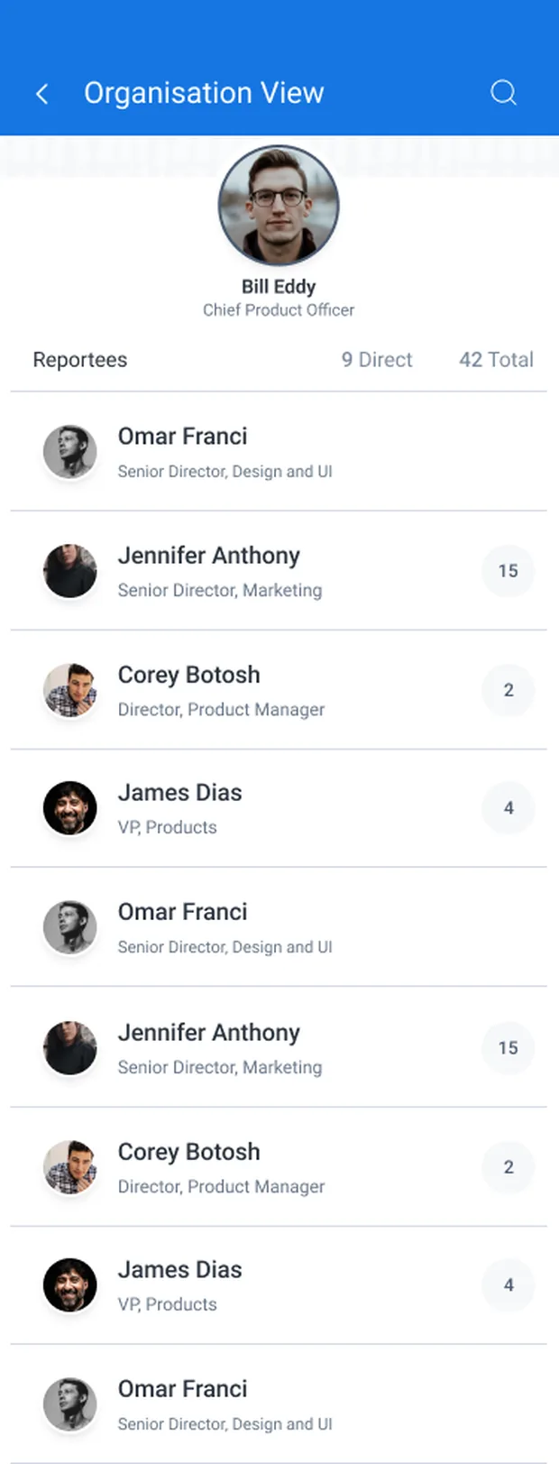
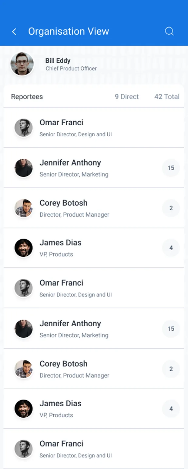
The counter reads 9 Direct, 42 Total. Direct is span of control; Total is everyone underneath. Two different questions, answered in one line.
The number on each row is that person's own total. You can see a branch is 15 people deep before deciding to open it.
Acting on a name
Every row is a person you can reach
The previous view displayed relationships but offered no way to act on them. Any row in the list opens an action sheet: Call, Send a mail, Recognise, View Profile, Message on Teams.
Recognise sits in the same list as Call. Recognition already existed elsewhere in Darwinbox. Putting it here means it is available on the screen where someone is already looking at a colleague, rather than in a separate module they have to remember to visit.
Context
The same profile, seen by two different people
A profile is not one screen. What sits in the action bar depends on whose profile it is, so the layout had to hold up with a different set of actions in it.
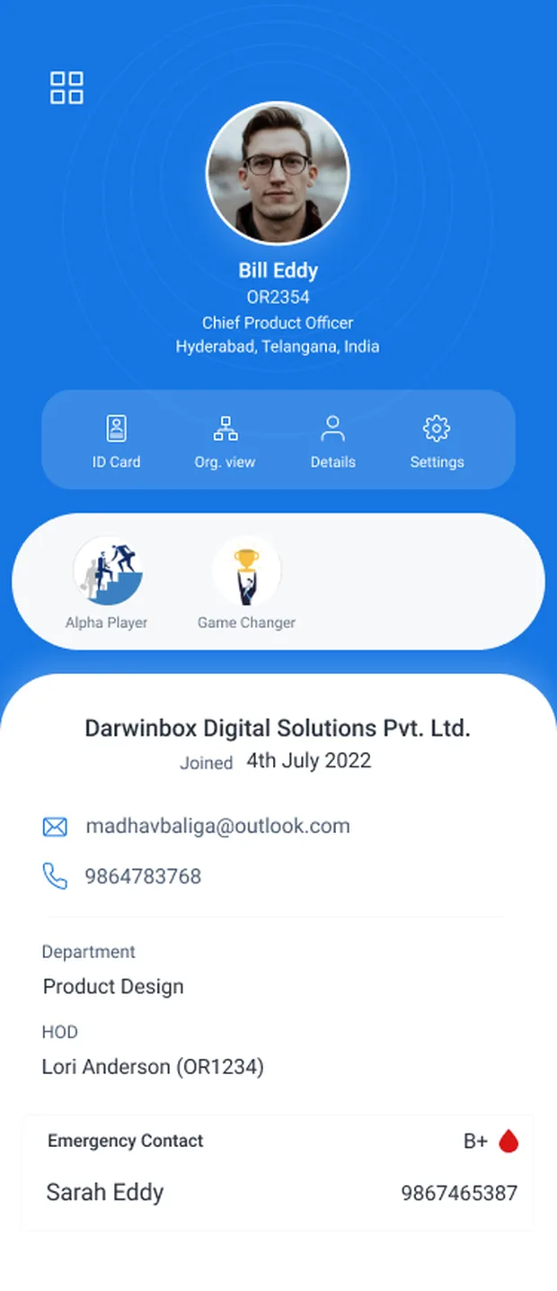
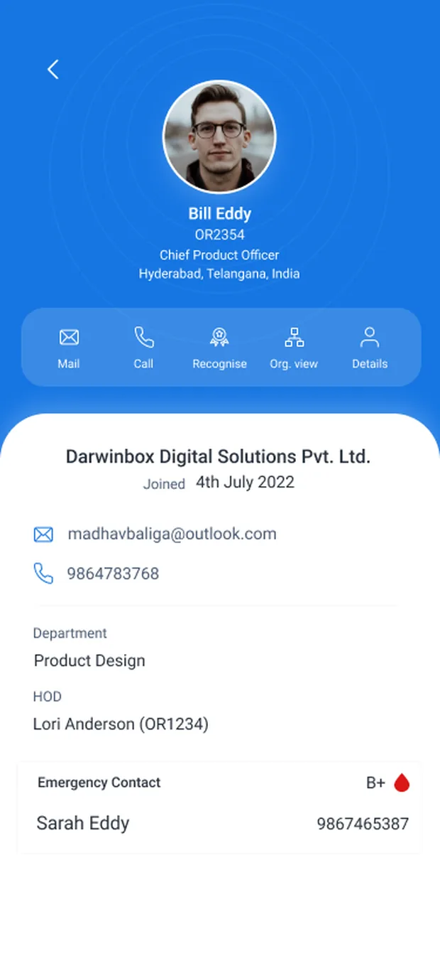
Same header, same body, same data structure. The bar re-populates around the viewer's relationship to the person, which keeps one template serving both cases.
Emergency contact, blood group, personal number. It sits at the bottom of a screen any colleague can open, which is exactly why field visibility has to follow permissions rather than layout.
Before / after
What each model can and can't do
| The job to be done | Desktop tree, shrunk | Organisation View |
|---|---|---|
| See the company's overall shape | ✓ | ✕ |
| Read a name, face and role | ✕ | ✓ |
| See who someone works with | ✕ | ✓ |
| Move sideways to a peer | ✕ | ✓ |
| Reach them in one tap | ✕ | ✓ |
| Stay legible at 10,000+ people | ✕ | ✓ |
The old view only wins on whole-org shape, which a phone can't deliver legibly at enterprise scale anyway. Search covers the case where someone needs to jump across the org rather than walk to it.
05 Decisions & Tradeoffs
What it costs, and how it's paid back
The screen adapts to the viewer
The action bar re-populates depending on whose profile is open: Settings and ID Card on your own, Mail and Call and Recognise on a colleague's. Emergency contact and blood group sit further down the same screen, so field visibility has to follow permissions rather than layout.
Search replaces the overview
Focus + context gives up the whole-org view. Search compensates: find anyone by name and land on their focused card with their neighbours already loaded, so arriving by search and arriving by walking produce the same screen.
06 Validation
How the model earns trust
Three things the focus-and-context model has to prove out. These are the questions I'd put in front of people, not claimed results.
- DiscoverabilityDo people find the sideways peer swipe on their own, or does it need a first-run hint? The partial avatars and the 1 / 3 counter are the only affordances, so this is the one to watch.
- OrientationAfter several hops up, down and sideways, can people still say where they are relative to where they started? The breadcrumb is there to catch this, but it has to be read to work.
- ReachHow long from opening the app to actually contacting the right person? Focus + context is only worth the trade against a flat directory if the walk stays short.
07 Reflection
The constraint I'd push on next is the one I worked around rather than solved: the view still only knows reporting lines. Dotted-line and cross-functional relationships are the ones people ask about most, and they're the ones the data model doesn't hold. Getting them in is a data problem before it's a design problem.
The screens