
AIoT · Smart Home · NextGenTV / ATSC 3.0
Come home to intelligence.
Every smart-home product assumes the phone. iZak bet the interface of the home on the one screen a household already shares, the television, and let that single decision drive the information architecture, the automation model, and how an entire home stays secure. This is the reasoning behind the bet, what it cost, and the system that followed.
Project snapshot
- Product
- iZak, AIoT intelligent-apps platform
- Primary surface
- Television (NextGenTV), with a load-bearing mobile companion
- Technology context
- Broadcast internet · ATSC 3.0 · next-gen TV tuner
- Data model
- Devices → Spaces → Playbooks, unified under one profile
- My role
- Lead product designer, research synthesis, product strategy, IA, TV & mobile UX
- Discipline
- Vision · personas · use cases · competitor analysis · product surfaces
- Status
- Concept: three design rounds to final screens
- Tagline
- Come home to intelligence
01 The starting point
A technology looking for a product
iZak didn't begin with a smart-home brief. It began inside ATSC 3.0. The team was already building for NextGenTV broadcast, and the unlock was realising the pipe could carry more than television: broadcast internet can deliver software, firmware and updates pushed over the air, to every receiver in range at once.
The economics made it worth chasing. The average U.S. household was running 25 connected devices in 2021, settling at 22 by 2022 (Deloitte, Connectivity and Mobile Trends), and each of those devices expects its own updates over its own connection. One broadcast signal can do that delivery job for every home in range simultaneously, at a fraction of the per-device cost. So the question stopped being "can we" and became "what consumer product earns this capability", and if nothing did, the honest recommendation was no product at all. That framing shaped every decision that follows.
Source: Deloitte, Connectivity and Mobile Trends survey, 2021–2022 editions02 Discovery
The home is shared. Its interface isn't.
Fragmentation is the obvious problem. Too many apps, too many brands, nothing talking to anything. It is real, and every competitor already claims to solve it, so it cannot carry the case on its own.
Research surfaced two problems underneath it.
Smart homes have one user and many inhabitants.In the multi-person households we studied, one person, the one who installed everything, had all of the control. Control lived in that person's phone, scattered across a dozen logins, and everyone else negotiated with the home through them. The fragmentation problem wasn't just "too many apps." It was that the interface to a fundamentally shared space was private. A phone-first product, however well designed, inherits that flaw by default.
Updates aren't neglected out of laziness.The cost of updating is paid per device, the benefit is invisible, and the timing is always wrong, mid-movie, mid-dinner, mid-use. People weren't careless; the system made care expensive. Insecure homes are a UX outcome, not a user failure. This finding is what made the broadcast tuner matter: it collapses the per-device cost to zero. The remaining problem, making invisible security feel like visible care, was a design problem. It became section 10.
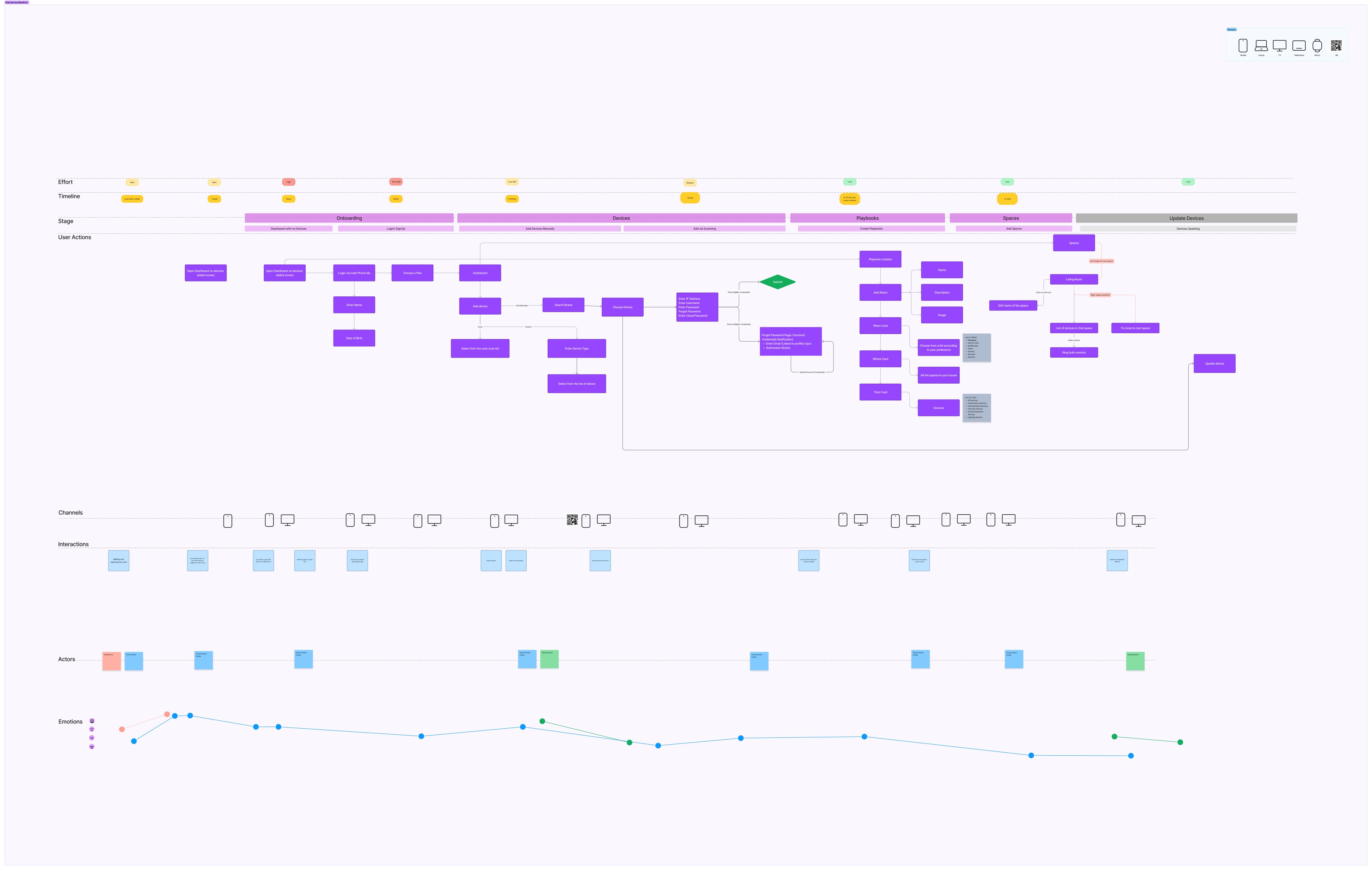
The end-to-end service blueprint, every stage from onboarding to device updates, mapped across user actions, channels, actors, and the household's emotional arc. This is the flow the Devices–Spaces–Playbooks model was drawn from. Open full size →
Five things came out of the blueprint that changed the design.
Effort peaks before any value arrives
The two highest effort ratings in the whole journey both sit in onboarding: the empty dashboard, then login and sign-up at around five minutes. People pay the steepest cost before the product has done anything for them. The blueprint already carried the answer in its interactions row, "scan QR to login, will direct to mobile phone", so v3 moved credential entry to the phone and gave the first-run dashboard something to do besides wait.
The longest task in the journey is authoring
Scene creation takes eight to ten minutes each, longer than any other action on the map, even though its effort rating is low. Long and easy is still long. This is the number behind template-first playbooks: editing a prepared playbook turns those minutes into a short edit, and the blank canvas becomes the fallback rather than the front door.
The TV is one channel of several
Mobile, laptop, TV, tablet, watch and QR all appear as delivery channels, and the interactions row keeps handing tasks between them: scanning a QR to log in, switching tabs to check an OTP. The division of labour between couch and pocket is not a later invention, it is what the journey already described.
The journey starts in the shop
Two stages sit before onboarding: walking and exploring the store, then choosing the right TV and smart devices, together spanning more than a week. The product is chosen long before it is opened, which is why the storefront belongs inside the experience rather than beside it.
The platform's other sides appear inside the consumer journey
The actors row runs salesperson, house owner, household, and manufacturers, with manufacturers turning up twice: once at device setup and again at updates. The two-sided model is not only a business diagram. It shows up as people the household actually deals with, which is why manufacturer-side deployment and device health sit in the platform section.
Three relationships to the same home
Research profiled three relationships to the home's current interface, and each one left a mark on the product.
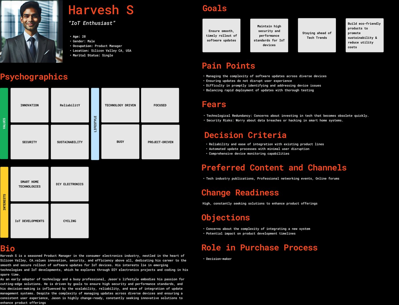
The admin
Harvesh S
IoT enthusiast · Product manager
Runs everything, and drowns in the maintenance of it. Values innovation, security, and efficiency.
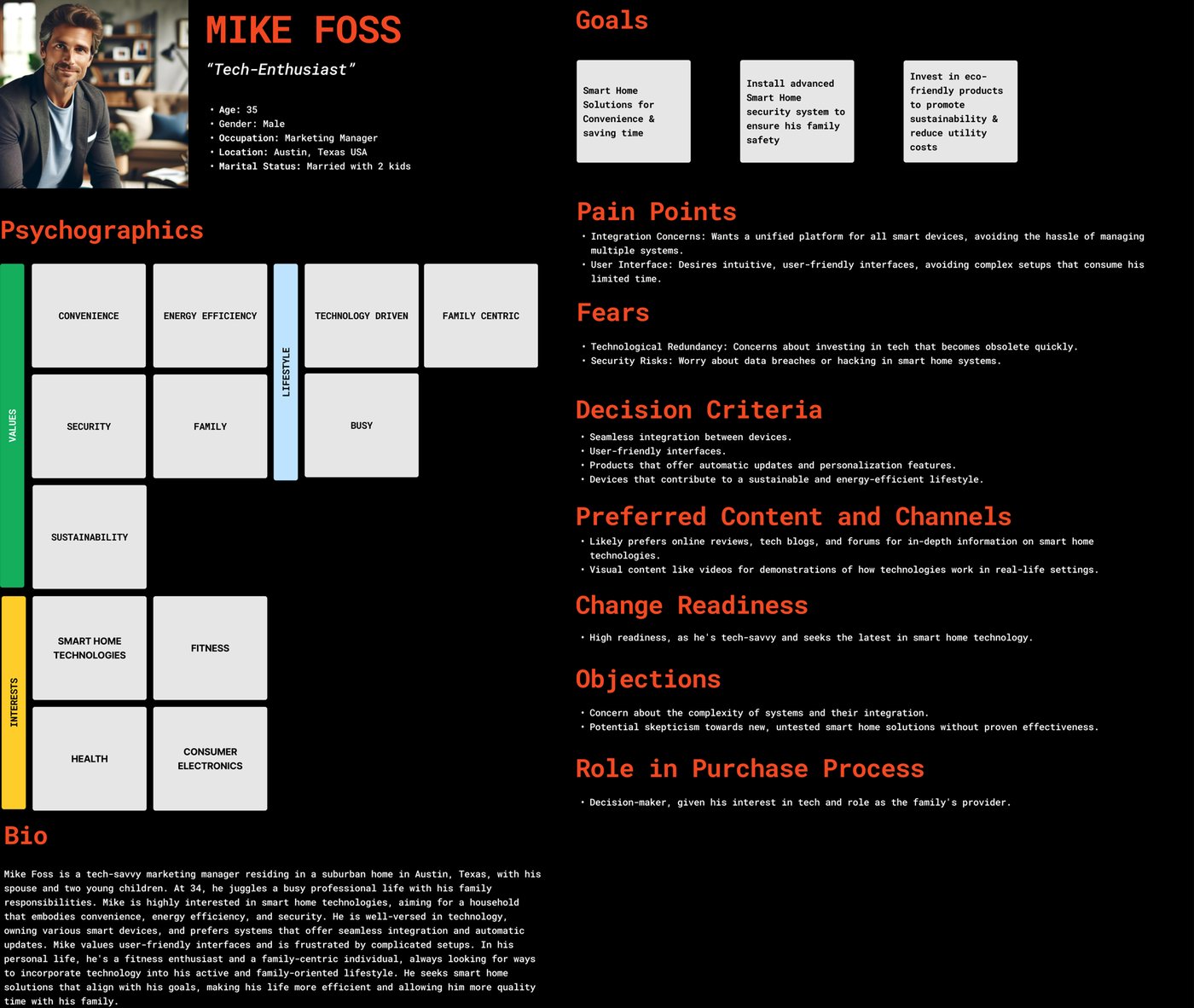
The locked-out optimizer
Mike Foss
Busy professional · Family of four
Wants outcomes, not systems: a home that runs itself, saves energy, and keeps the family informed.
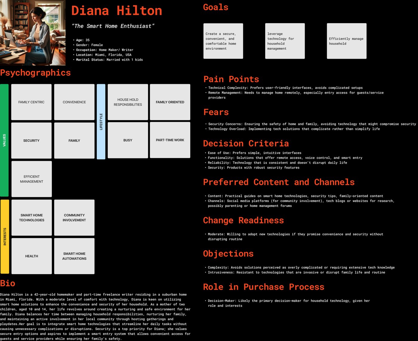
The orchestrator
Diana Hilton
Writer · Community host
Runs the household's rhythms, mornings, bedtime, guests, but the smart home doesn't speak her language.
The competitive gap
Benchmarking SmartThings, Home Assistant, openHAB, Wink, and others, I sorted every capability into four tiers, a shared language for what's table-stakes, what needs work, and where the openings are.
Existing
Standard functionality present in iZak and competitors alike: device groups, controls, routines, schedules.
Partially present
Capabilities with limited scope in iZak versus more extensive competitor offerings.
Potential
Competitor features not yet in iZak, clear growth opportunities.
Innovative
Unique iZak territory: broadcast updates, community intelligence, TV-first CX.
Control is table-stakes. Nobody owned the shared household experience, or the work of keeping devices current. Every competitor assumed the phone. That was the opening.
03 The decision
Where should the home's interface live?
The technology fixed where the tuner lives. It did not fix where the interface should. The industry default, a companion mobile app, was still the safe move, so before committing the home's interface to the television I pressure-tested it against the alternatives.
Why the TV won
Three arguments carried it. It's the only screen in the home that's communal by default, which is what the shared-home finding demanded. The differentiator literally lives inside it, putting the experience anywhere else separates the product from its edge. And the daily job of a smart home is monitoring, not fiddling: homes are checked constantly and configured rarely, and a glanceable 10-foot dashboard fits the frequent job better than a 6-inch screen you have to unlock.
What the decision cost
Committing to the TV wasn't free, and the honest accounting shaped the rest of the product.
A TV idles more than it plays
Modern TVs are rarely black; between sessions they sit in wallpaper and ambience modes. So iZak needed an ambient state of its own: glanceable home status designed to live on the screen, following the same ambience-mode approach the platforms take. Mobile still carries configuration and the away-from-home half (the ambient state is section 11).
A remote is a hostile authoring tool
Anything creation-heavy, building an automation, configuring a device, had to be radically restructured for directional input, or deliberately routed to the phone.
A shared screen has no privacy by default
Camera feeds and presence data on a 55-inch screen in front of guests forced profiles and permissions from "roadmap feature" to "launch requirement."
The division-of-labour rule
Understand and orchestrate from the couch.
Configure and act in the moment from the pocket.
Every screen decision downstream was tested against this rule.
04 The big-screen challenge
Bringing dashboard-style control to the couch
A TV is not a phone stretched wide. People sit metres away, drive it with a remote, and want information they can absorb in a glance. These six principles aren't aesthetic preferences, each is a direct consequence of the surface we chose.
10-foot readability
Type, spacing, and cards tuned to be legible from across the room.
Remote-first navigation
Every primary action works through directional focus, never a cursor.
Glanceable status
Energy, security, and device state readable in a single look.
Progressive density
A calm home surface that opens into detail only when asked.
High-contrast hierarchy
Alerts and critical states get immediate visual priority.
Household-shared
One surface many people read, with profiles and permissions layered underneath.
05 The iterations
Three rounds to ten feet
It took three rounds to reach a working 10-foot system. The first two versions carried habits from desktop and mobile design, and each round removed a layer of them. The mistakes are shown next to the screens that contain them, and each correction led to a decision in the final design.
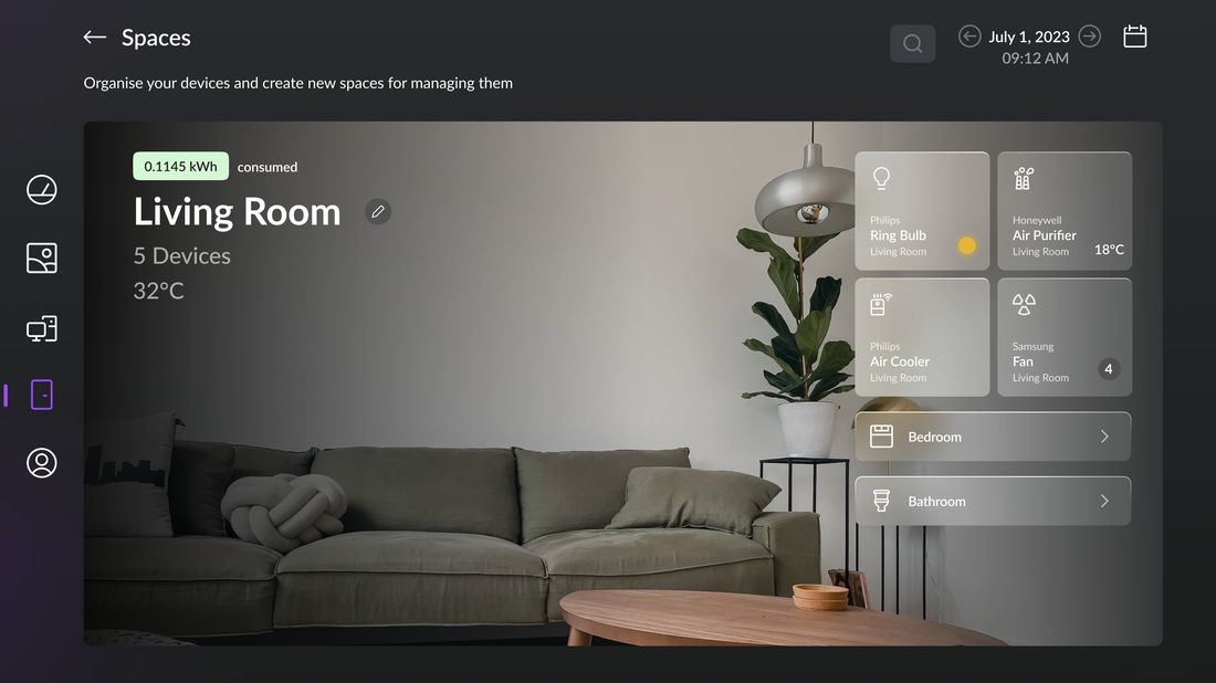
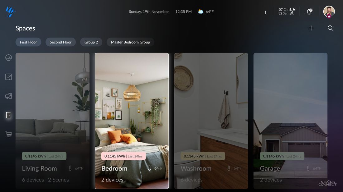
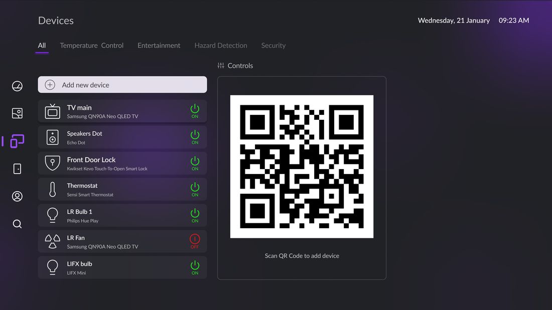
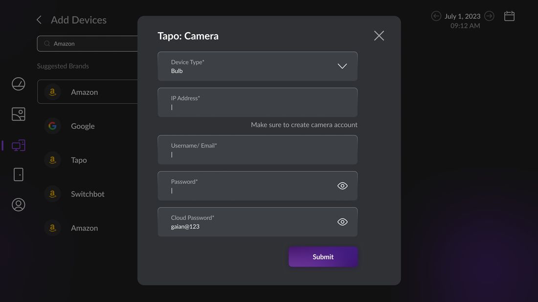
Four surfaces, three rounds
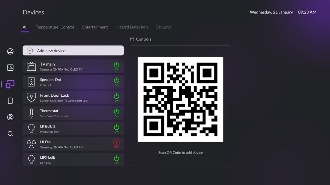
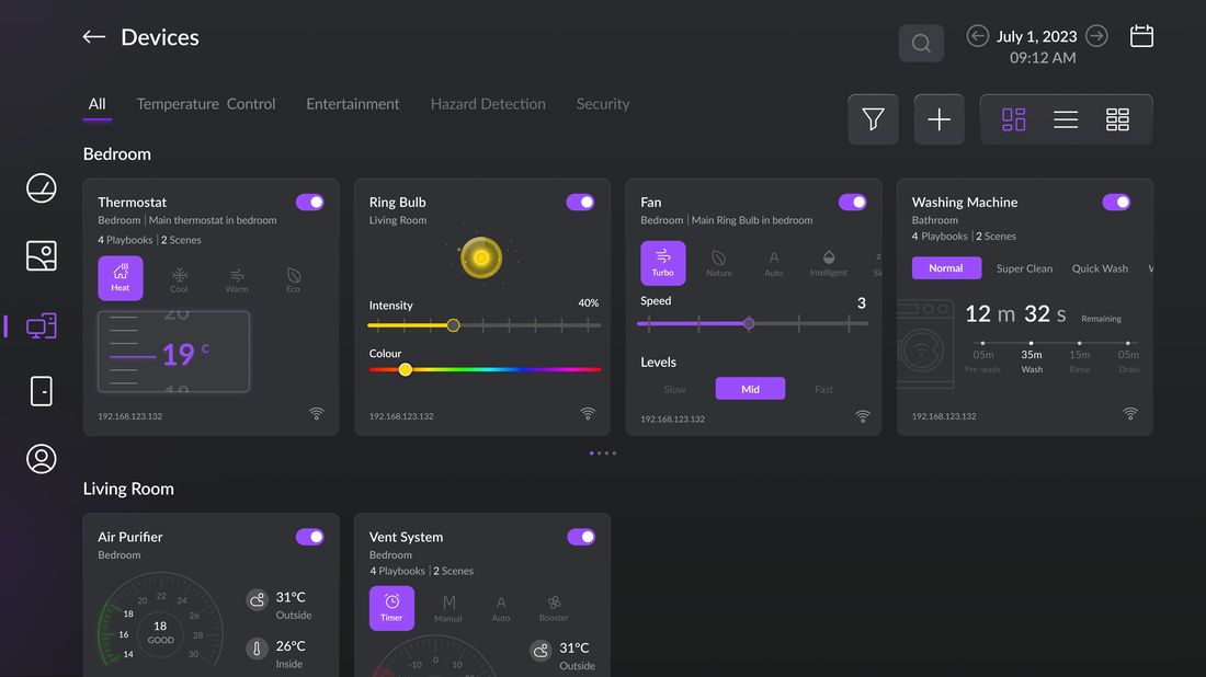
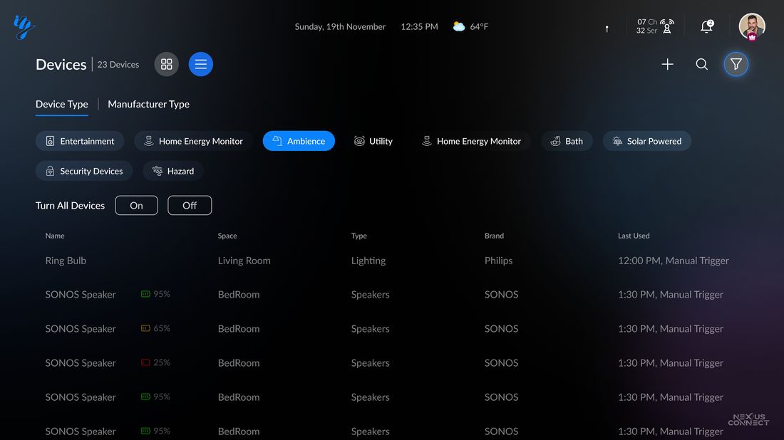
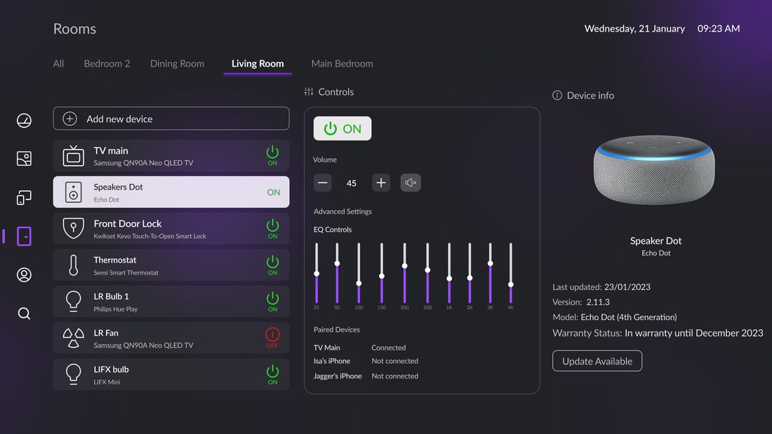
The same four surfaces, redesigned in each round. Details for each round follow below.
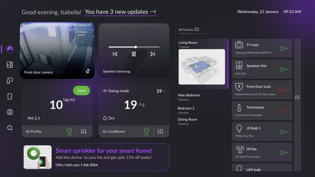
Round one: a desktop dashboard in a TV costume
Round one scaled up a web admin panel. The dashboard carried the main problems.
- No clear navigation path. Panels, lists and floating controls compete, and a remote has no predictable next press; you cannot tell where focus will land or how to reach what you want.
- Poor use of the canvas. A 3840px screen spent on cramped columns and dead corners: content neither fills the space nor earns the emptiness.
- Exploration without a system. Ten dashboard variants, no governing grid, no shared component language.
All of round one
Thirteen screens from the first round.
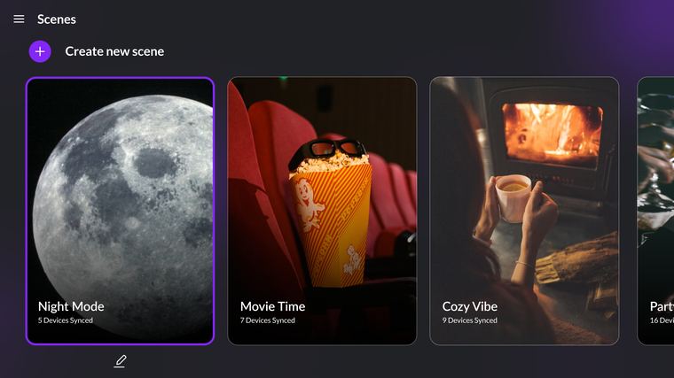
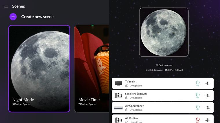
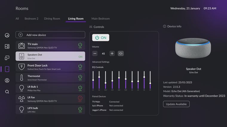
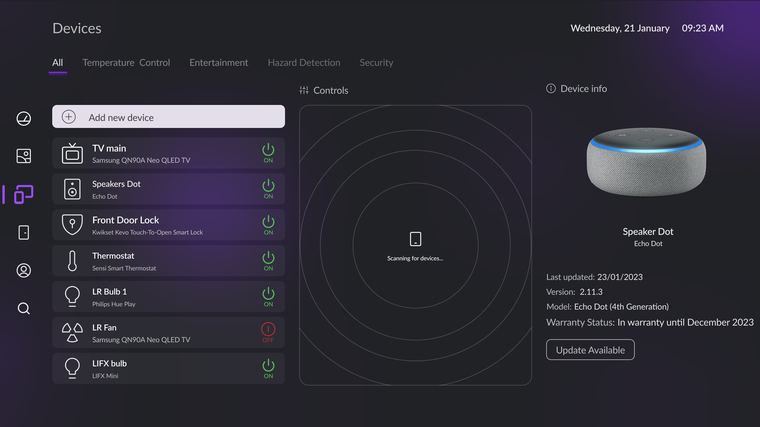
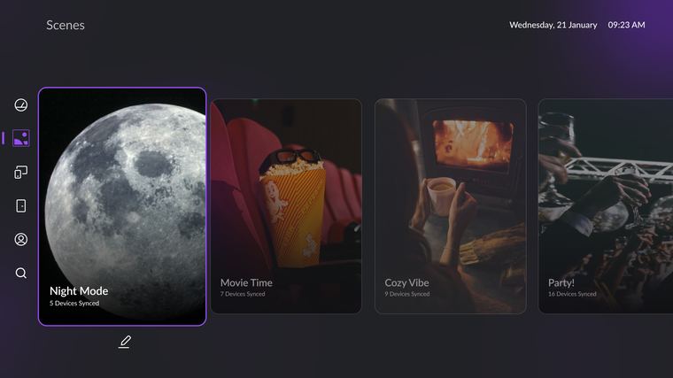
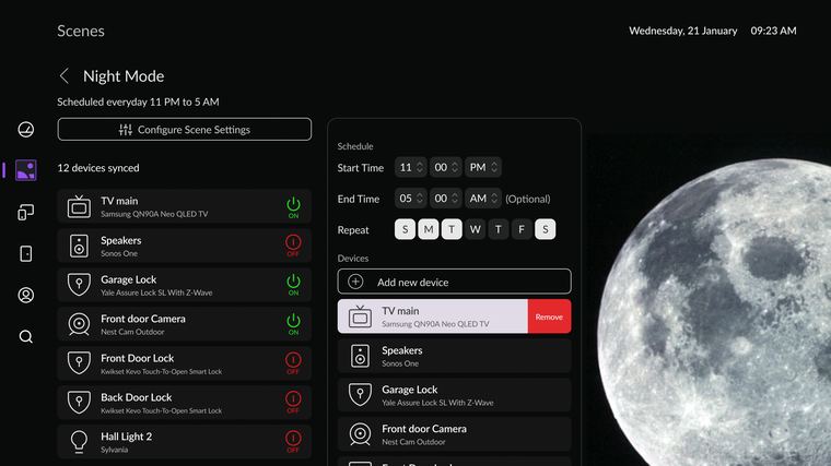
Two decisions from this round carried into the final system: the focus ring and QR pairing.
Round two: dark, but a poster, not an instrument
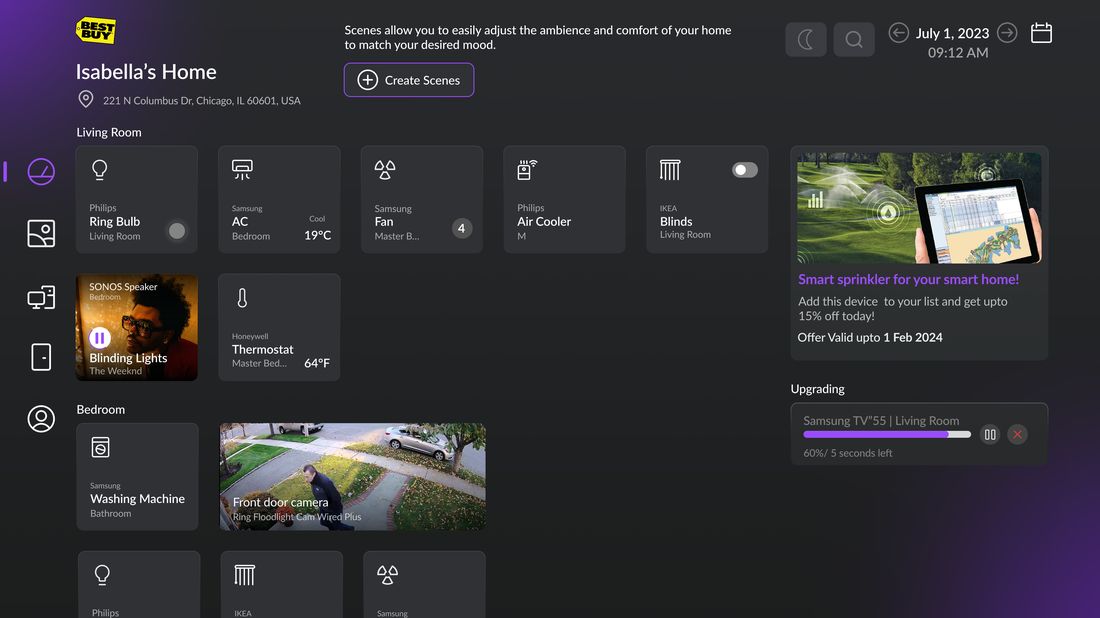
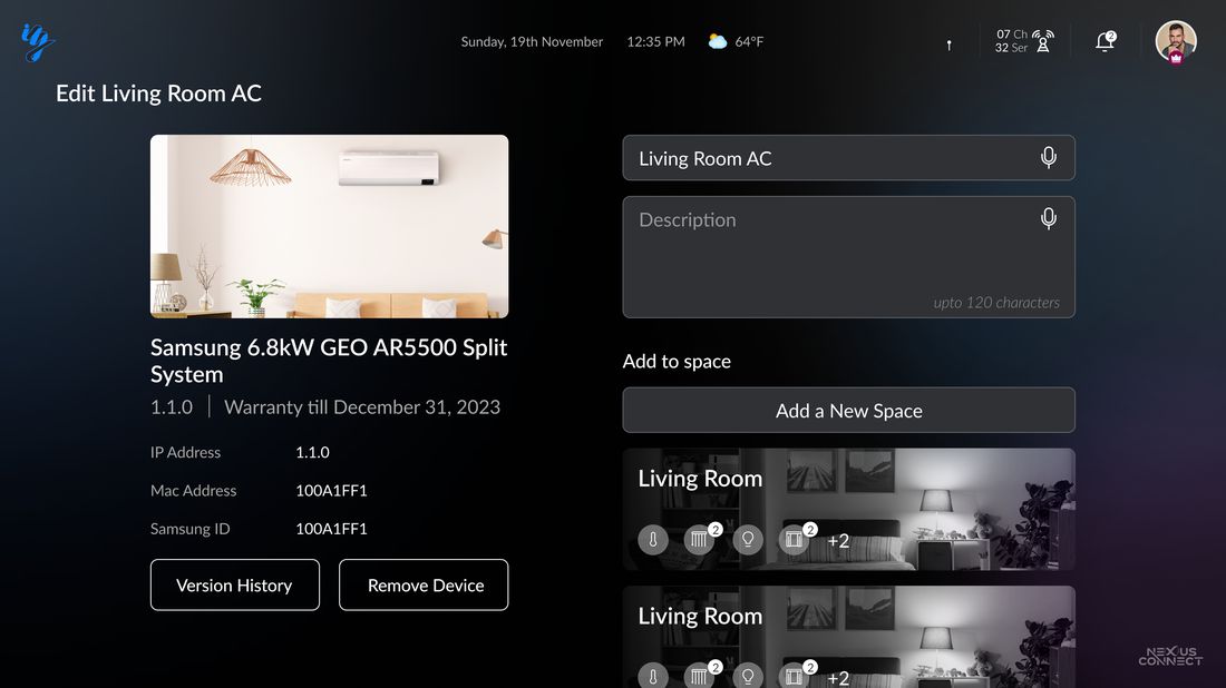
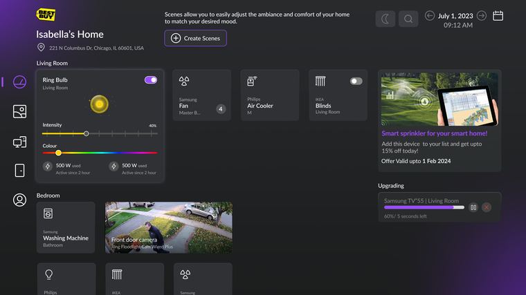
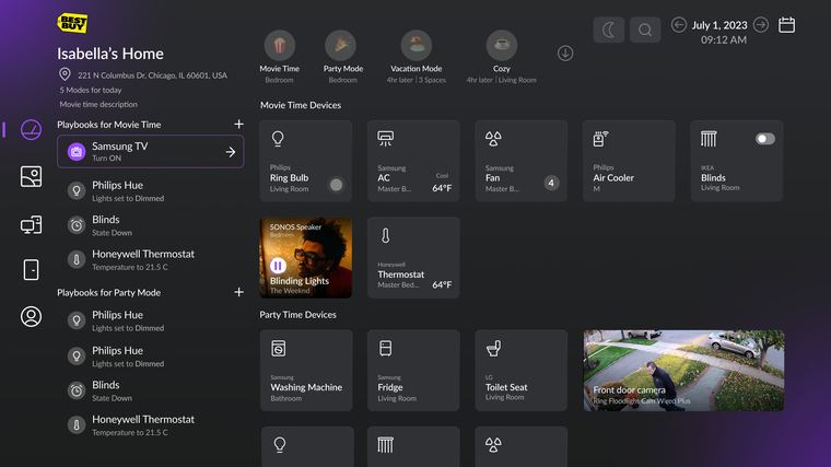
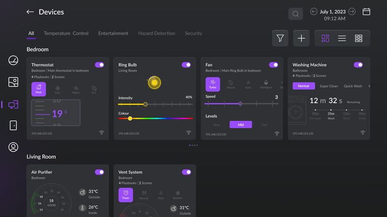
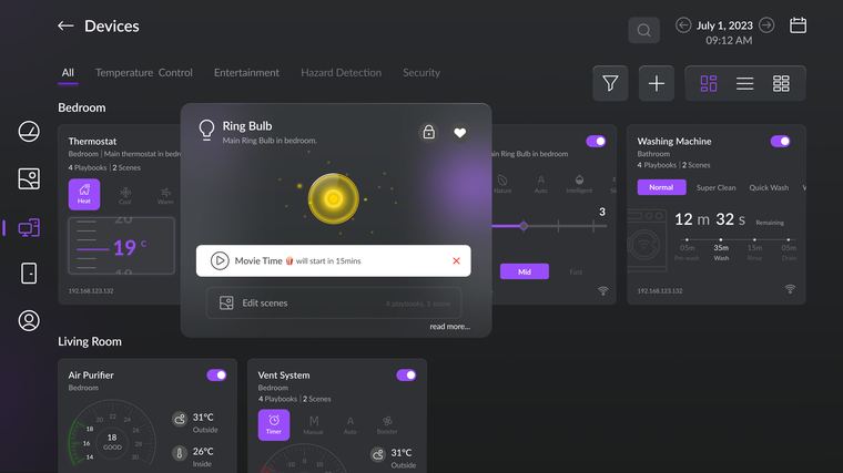
Round two used a dark palette but kept desktop patterns: small type, dense layouts, and controls that assume a pointer. Four screens, four problems.
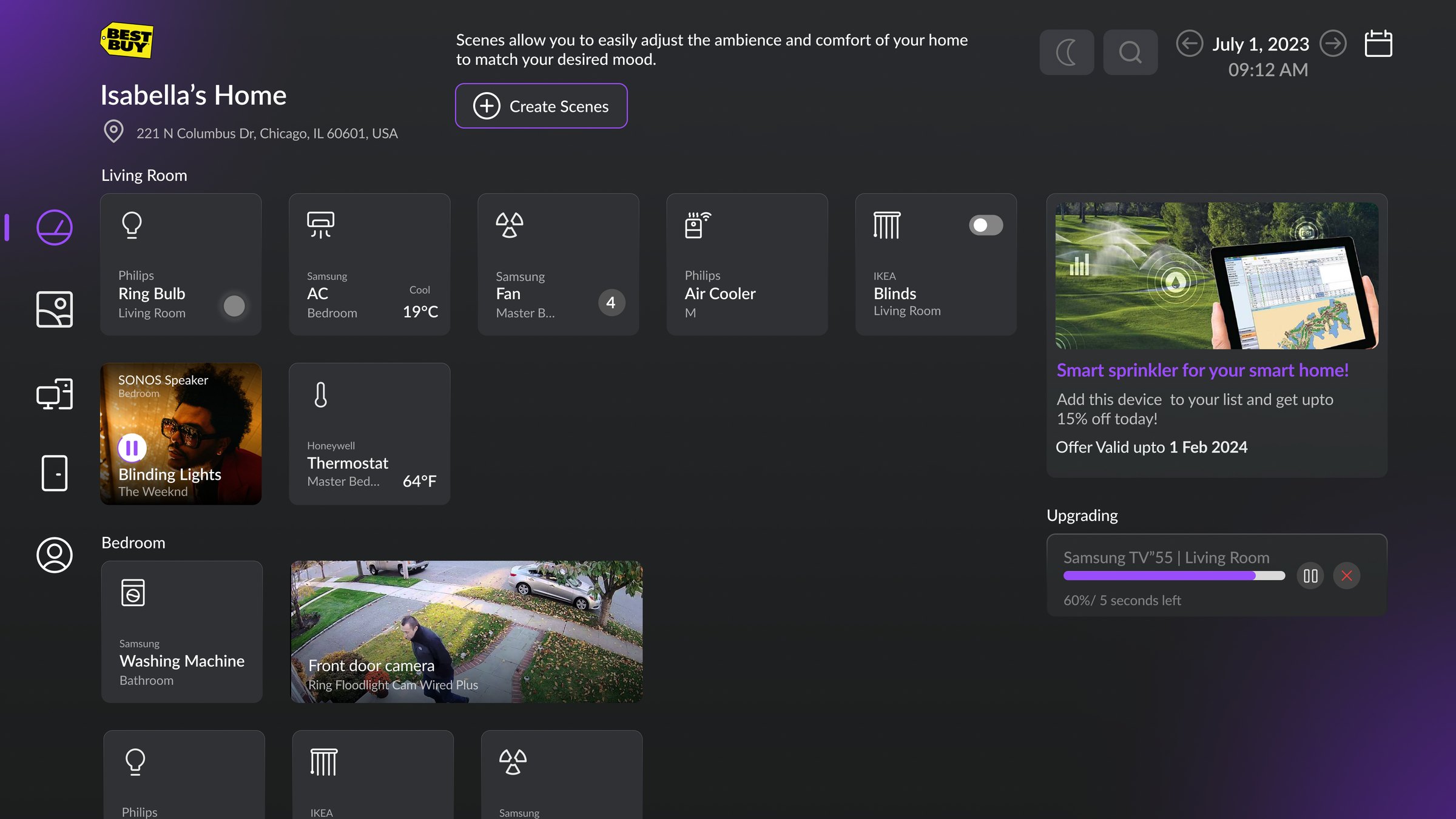
- Hard to read at distance. Small type, tight rows and mixed card sizes with no clear reading order; the layout works at a desk and dissolves from a couch.
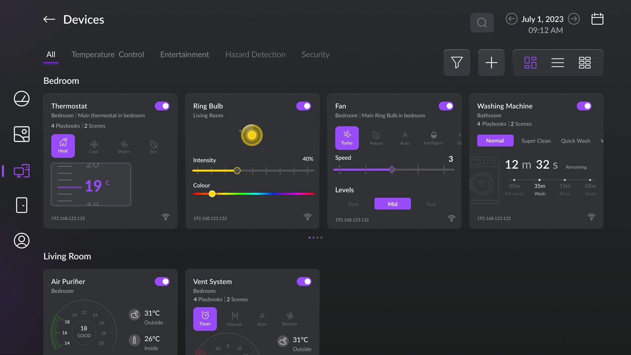
- Interactions undefined for a remote. Sliders, colour pickers and multi-state chips inside every card: none of it maps to a D-pad, so control is hard to reach and harder to predict.
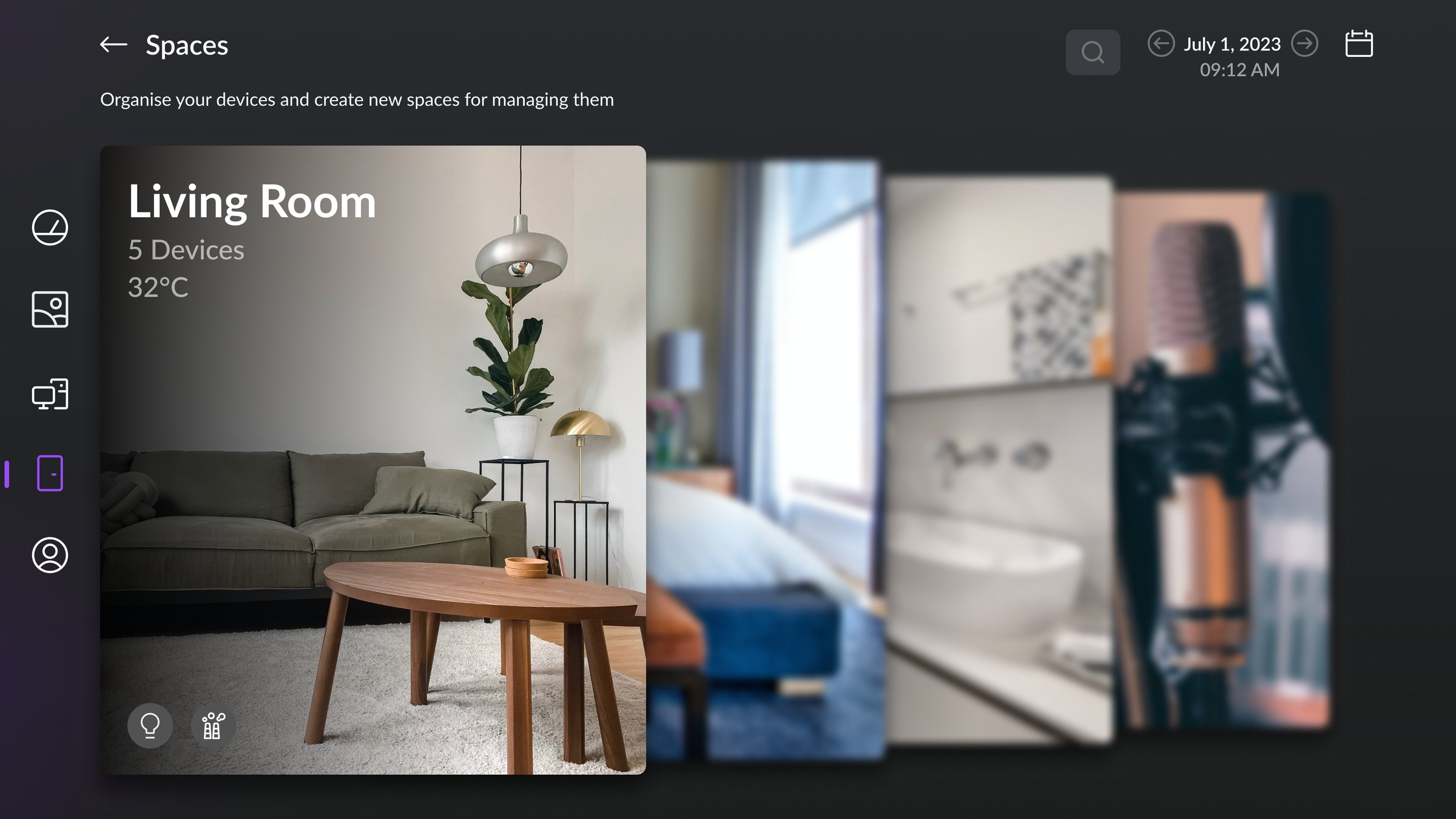
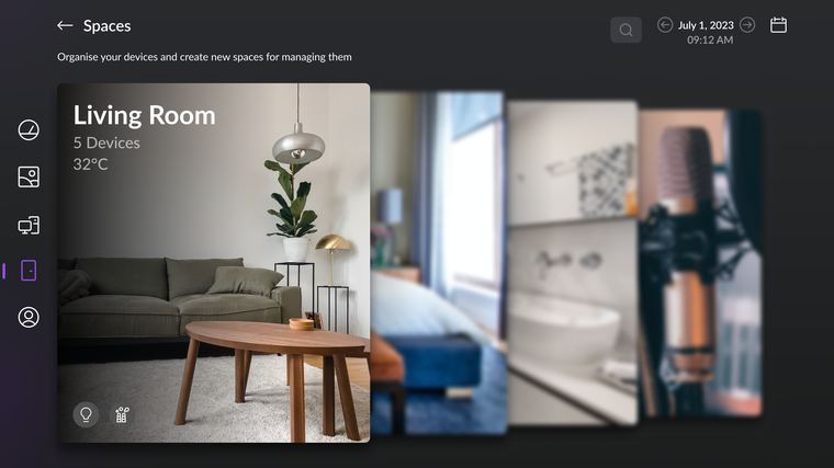
- One option at a time. The layout shows a single space's options at once; comparing rooms or moving between them means paging blind.
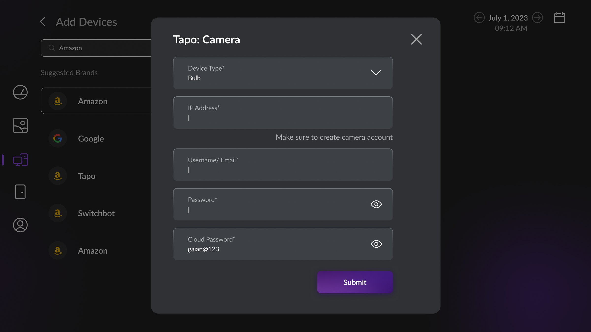
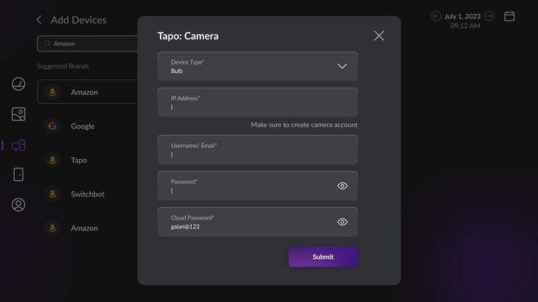
- Long forms with no QR alternative. Manual setup demanded field-by-field typing with the remote and offered no way to hand the job to the phone. Round three adds the QR path.
All of round two
Thirteen screens from the second round.
Round three: the ten-foot system
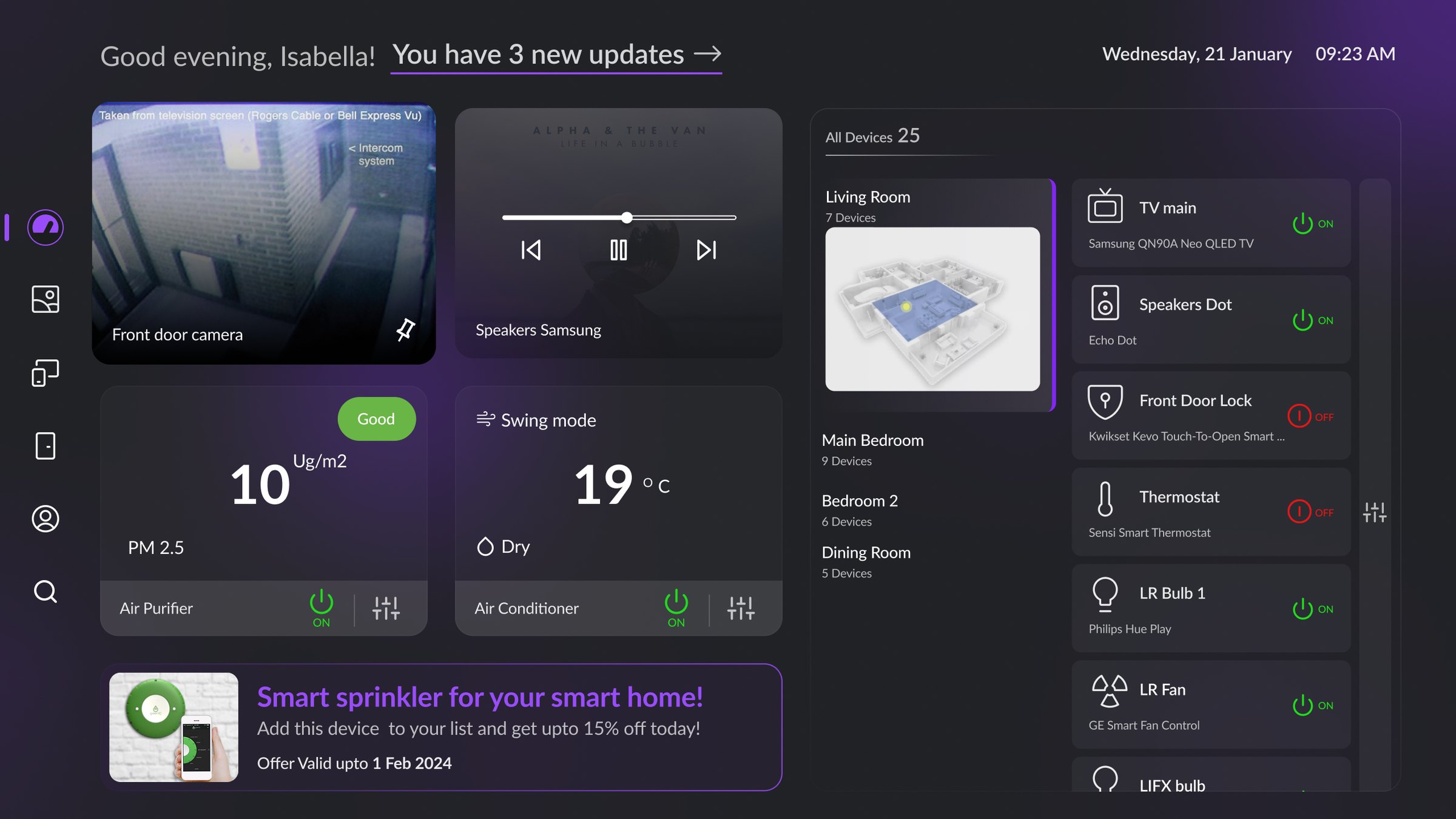
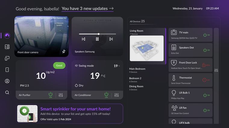
v3 is what the first two rounds paid for. Each screen sits next to the mistakes it answers.
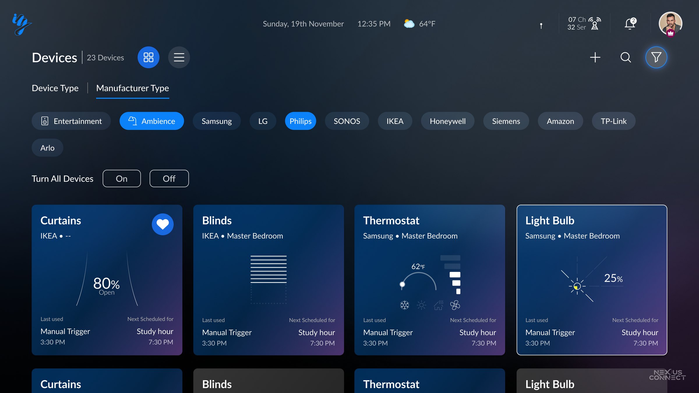
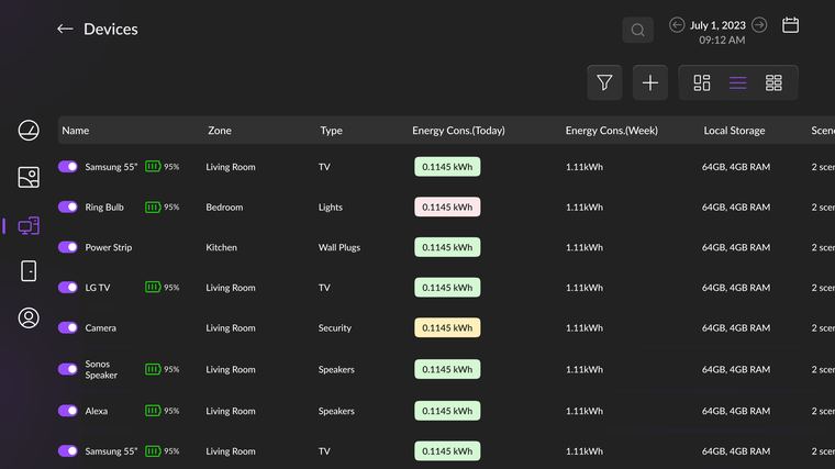
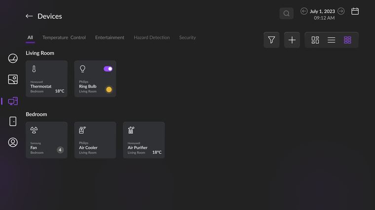
- One muted surface, one restrained accent answers the purple chrome and the rainbow tiles: colour is used for ranking, not decoration.
- A labelled rail, pagination, and a filter sheet answer round one's missing navigation and round two's dense grids: fewer focus stops per screen.
- Distance-scaled type and chunked labels answer desktop density: readable from the couch, not the desk.
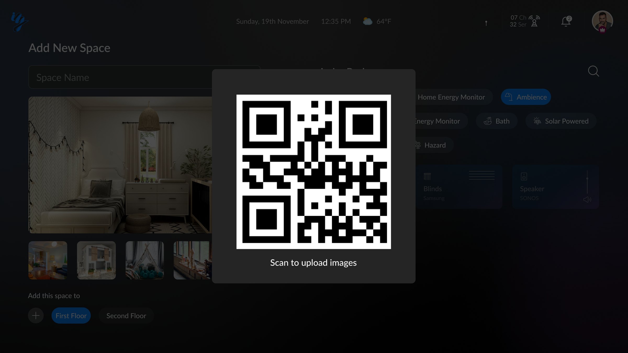
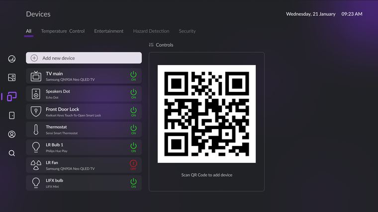
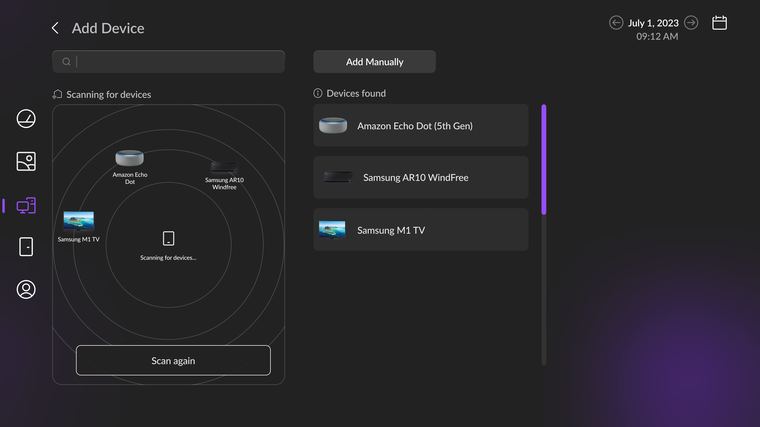
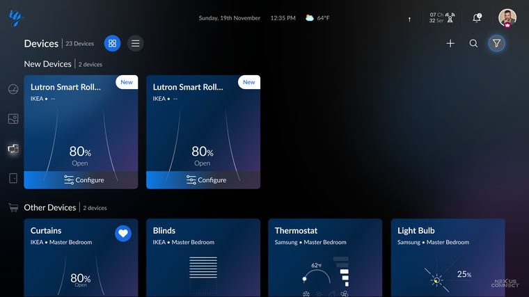
- QR pairing from the phone answers the on-screen form: text-heavy setup leaves the TV entirely, text entry moves to the phone.
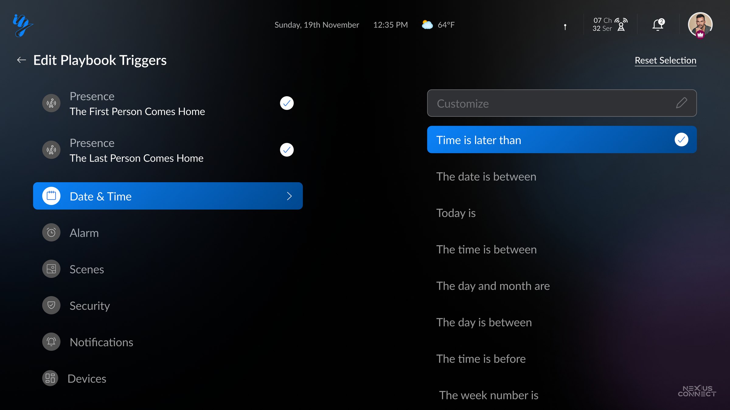
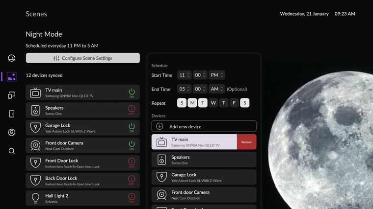
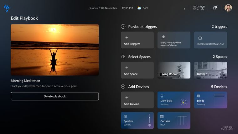
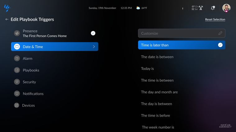
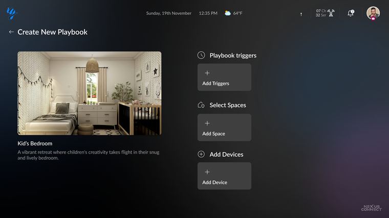
- Pickers and templates answer toggle-flip automations: "Scenes" you switch became Playbooks you compose, with presence and time as structured conditions.
Round three in full
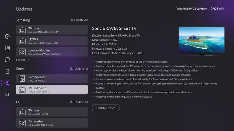
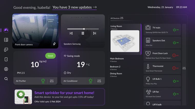
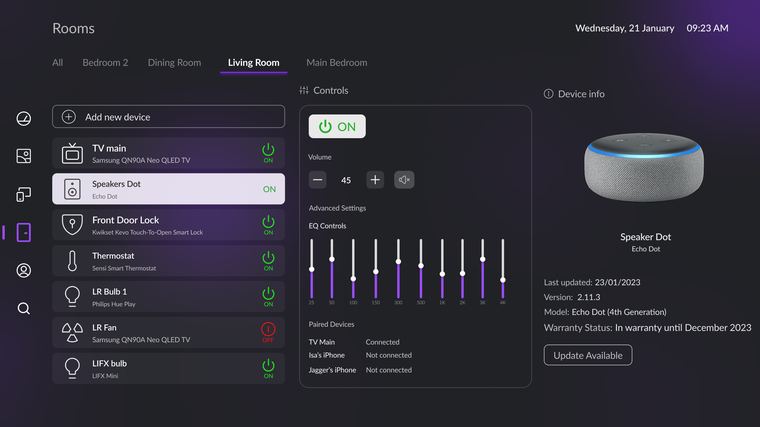
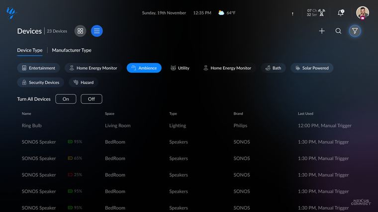
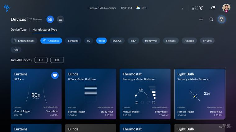
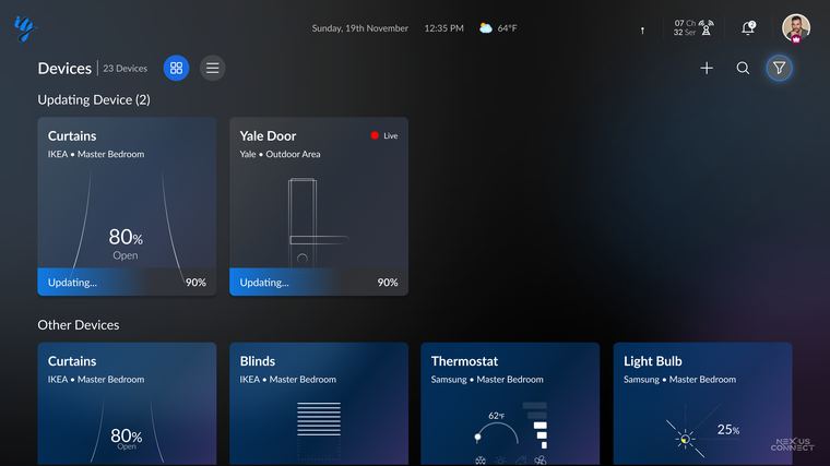
Fourteen screens, each showing one decision.
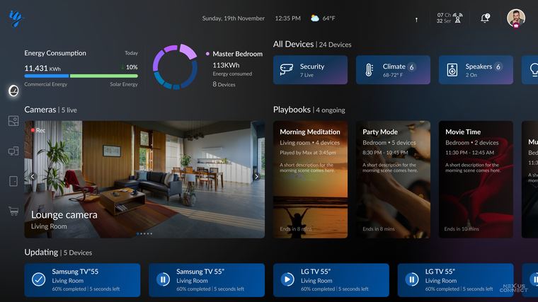
The home surface
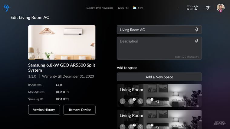
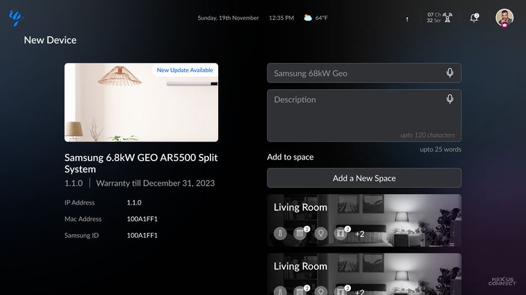
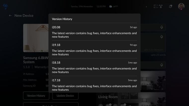
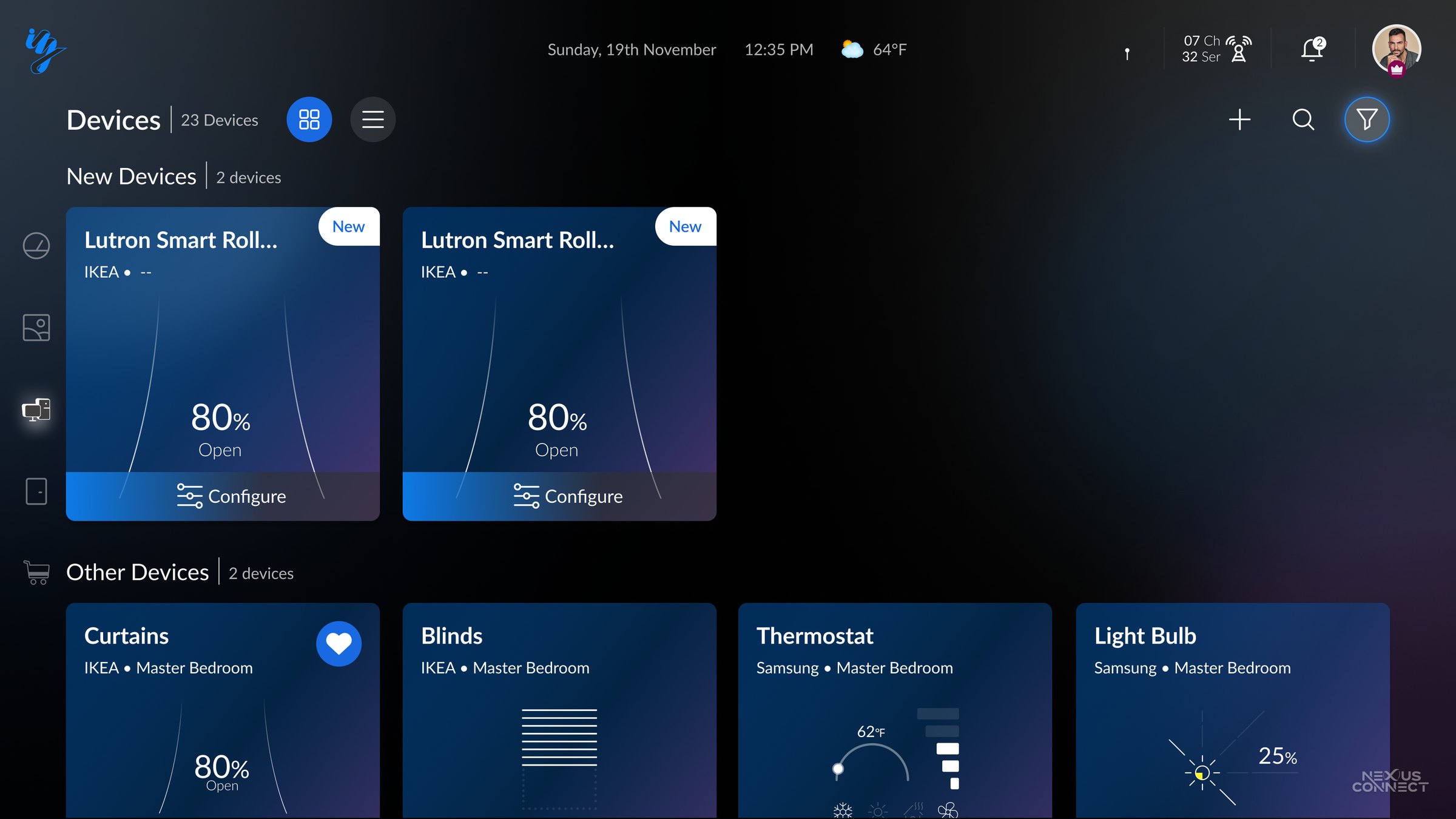
Adding and maintaining a device
Playbooks
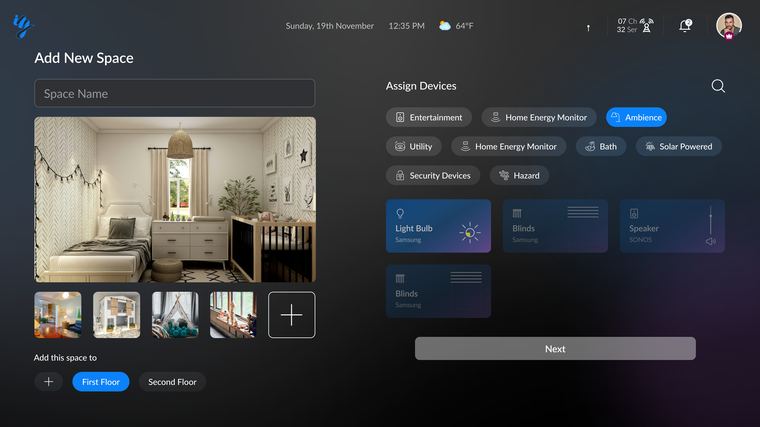
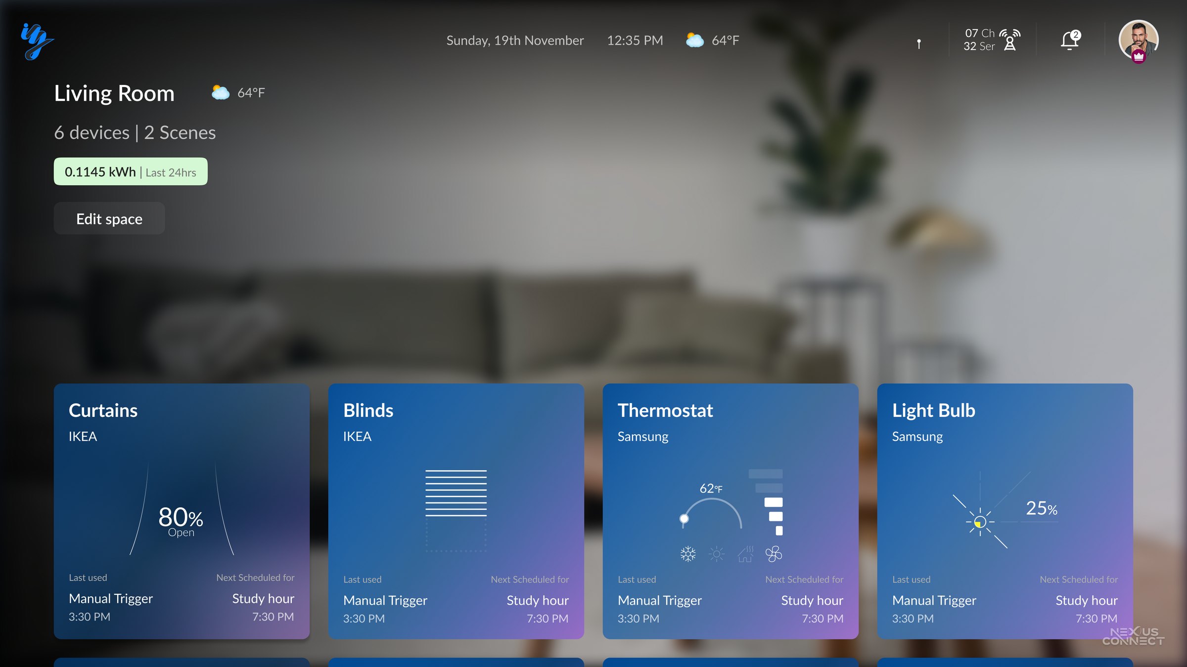
Spaces
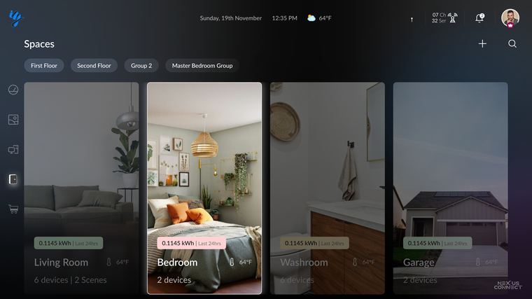
Every other screen on this page is round three.
06 Platform alignment
Checked against the ten-foot rulebooks
v3 wasn't styled into shape, it was audited against the two platform rulebooks for the living room: Apple's tvOS Human Interface Guidelines and Google's Android TV design guidance. Each card pairs the platform's rule with where v3 answers it, and with the round that broke it first.
Every interactive element needs an unmistakable focus state
tvOS navigation runs on a focus engine rather than a cursor: the focused item lifts, scales and glows so people can always see where they are. In v3, one focus treatment covers cards, chips and the rail. Round one shipped hover and touch furniture with no focus definition.
developer.apple.com, HIG, Focus and selectionLight text on dark surfaces; keep colour desaturated
TVs render colour hotter than monitors, and a bright canvas glares in a dim room, so the guidance is light on dark with muted hues. In v3, one dark surface and one restrained accent. Round one used a saturated purple across every surface; round two gave every tile its own colour.
developer.android.com, Design for TVType scales up; text breaks into scannable chunks
Distance kills small type and dense paragraphs, so TV body text starts around 24sp with larger headings and chunked content. In v3, display scale titles, short labels, and no paragraph that has to survive the couch.
developer.android.com, Design for TV, StylesRespect the overscan-safe zone
Panels can crop the outer edge, so primary UI stays inside a safe margin: 5% on Android TV, which is 48px at the sides and 27px top and bottom at 1080p, and roughly 60pt vertical with 80 to 90pt horizontal on tvOS. In v3, generous insets on every surface. Round one ran content toward the edges.
developer.android.com, TV layoutsA predictable D-pad grid, with the fewest presses possible
Directional navigation needs a spatial grid where every press moves focus somewhere obvious, and every element on screen is a press someone pays for. In v3, a labelled rail, aligned card grids, pagination and a filter sheet. Round two put dozens of equal tiles on one screen.
developer.apple.com, Designing for tvOSKeep text entry off the television
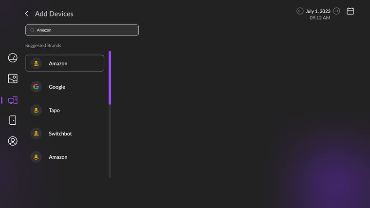
Toggles, forms and thumb-scale controls do not survive the living room, and the platform guidance is to keep gestures minimal and avoid on-screen typing. In v3, device pairing hands text entry to the phone by QR. Round two asked the remote to fill a form field by field.
developer.apple.com, Designing for tvOSThe Android robot is reproduced from work created and shared by Google and used according to Creative Commons 3.0 Attribution. Apple and tvOS are trademarks of Apple Inc., referenced for platform identification only.
07 Information architecture
Devices, Spaces, Playbooks: the nouns and verbs of a home
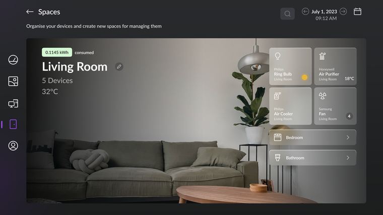
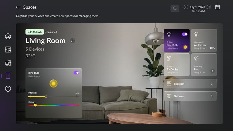
Round one split the home across tabs: Rooms, Scenes, Devices, each a silo (evidence in section 05). It matched how manufacturers organize, not how households speak. Nobody says "the Philips Hue A19", they say "the bedroom light", and no single tab could answer them. v3 collapsed the silos into one model.
The model had to carry both mental models as equal citizens: what a thing is (Devices), and where it lives(Spaces). Playbooks sit on top as the verb layer, if devices and spaces are the home's nouns, playbooks are its verbs.
The rename tells the story: rounds one and two called automations "Scenes", language borrowed from AV presets, something you switch on. v3 renamed them Playbooks, because a scene sets a mood once, while a playbook orchestrates devices, spaces, and conditions over time. The noun changed because the model changed.
08 The home dashboard
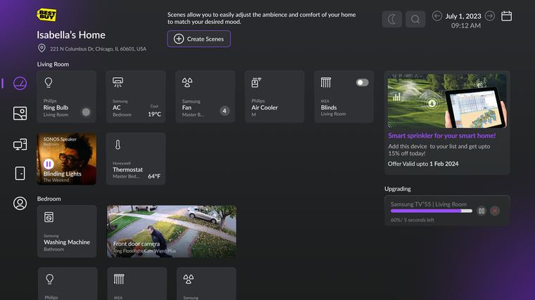
Everything the home is doing, in one glance
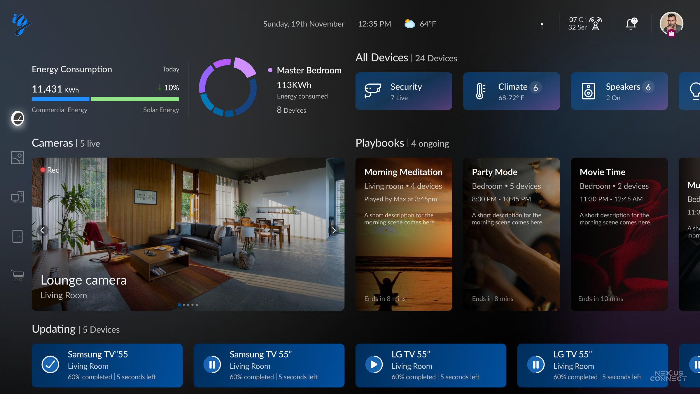
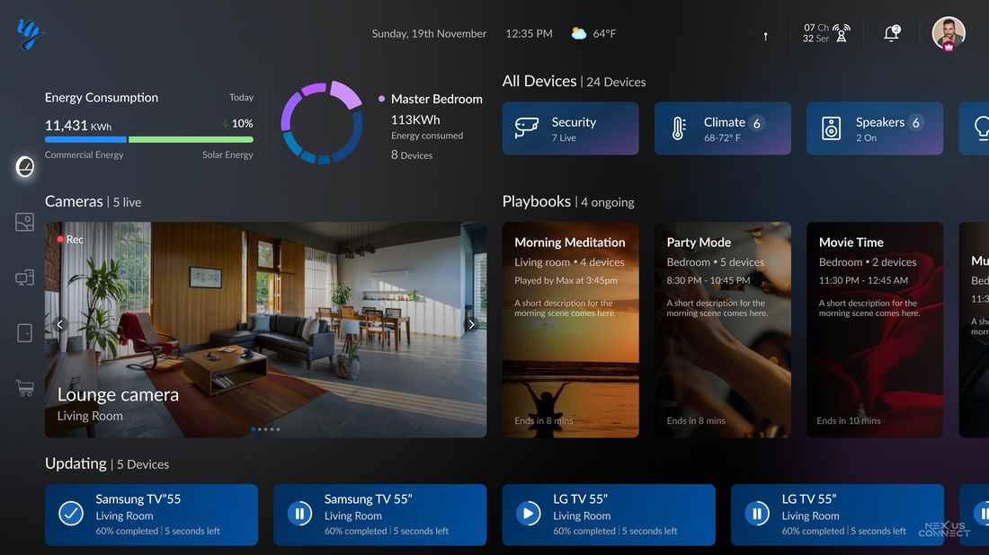
The home surface answers the four questions a household actually asks from the couch: how much energy are we using, what is the home doing right now, is everything safe, and what needs my attention.
On a remote, every extra card adds key-presses, so the layout keeps any primary answer within a few directional moves, with alerts first in the focus order.
Round one's dashboards literally were mission control, twenty-plus targets, dials, camera walls, thin labels on heavy chrome (section 05). They demoed well on a monitor and glanced terribly from a couch. The v3 surface is calm at rest and dense on demand, eight cards answering the four questions, each opening into detail only when asked.
Energy
Live consumption split across commercial and solar, with a per-room breakdown.
Devices
All 24 connected devices, grouped and controllable at a glance.
Cameras
Live security feeds surfaced right on the home surface.
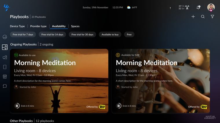
Playbooks
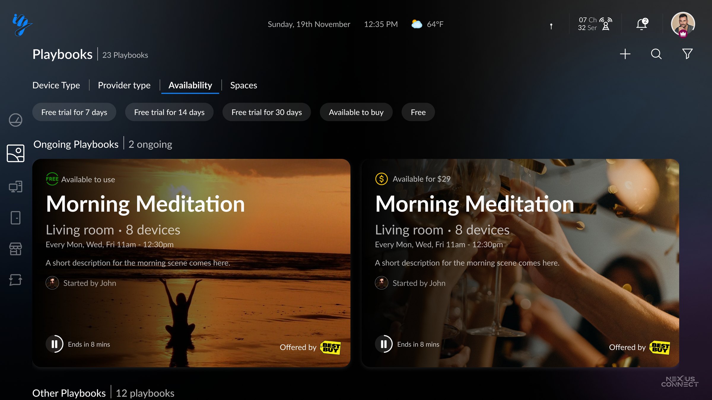
Ongoing automations, Morning Meditation, Party Mode, running now.
Updating
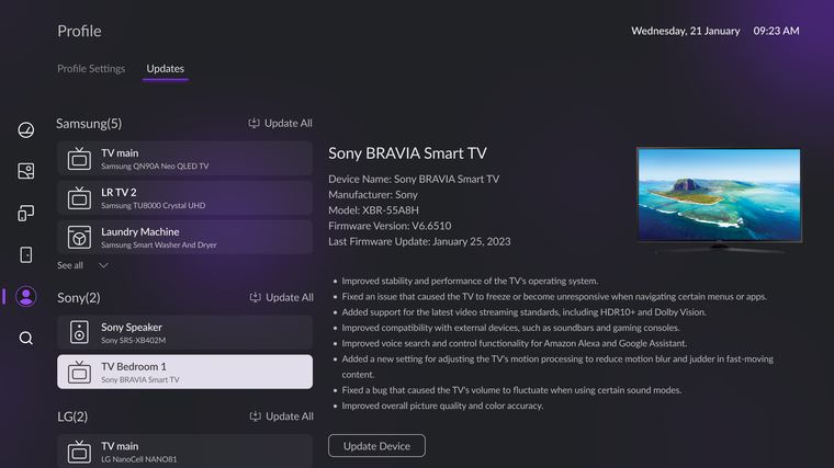
Firmware rollouts in progress across TVs and devices, with live status.
Climate
Temperature and comfort state for every space in the home.
Speakers
Audio devices and what is playing, ready for scene control.
Profiles
A shared identity, so the home adapts to who is home.
09 Playbooks
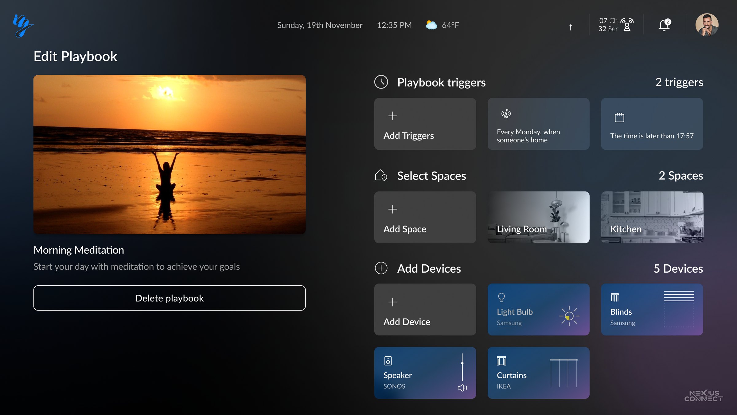
Automation you can author with five buttons
Playbook authoring was the hardest interaction problem in the product: building trigger-condition-action logic with a D-pad. Rounds one and two dodged it with phone furniture, rows of scene cards behind toggle switches (section 05), which made automations things you flip, not things you author.
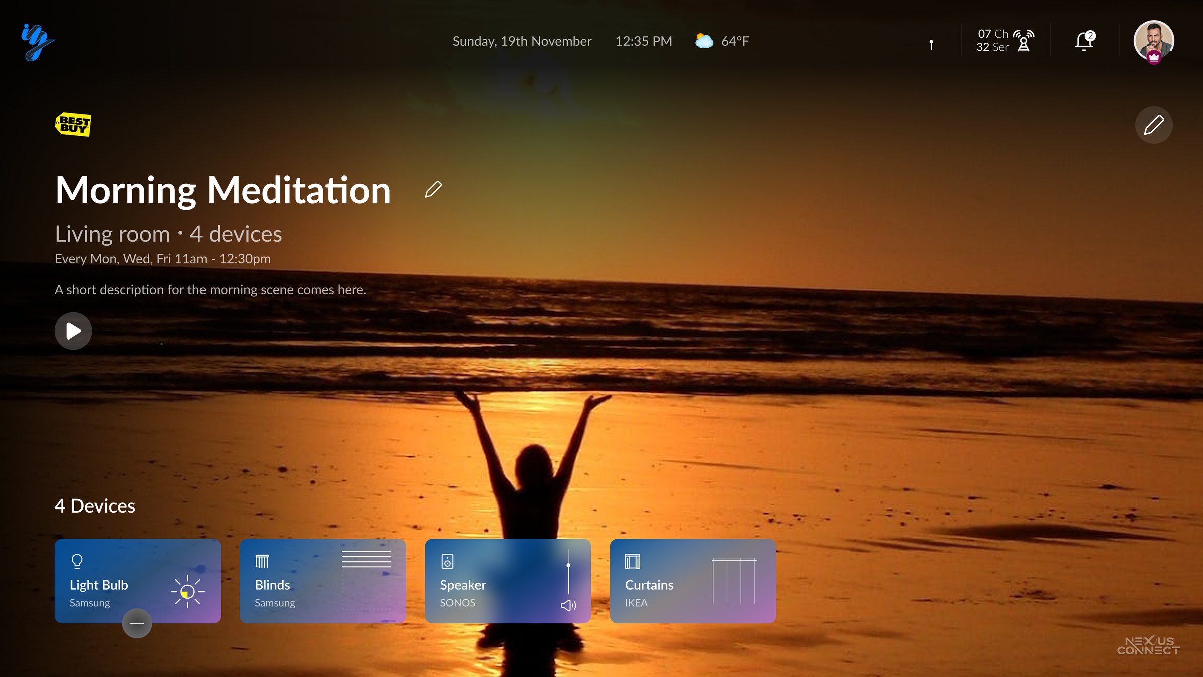
The redesign restructured authoring as sentence assembly from constrained pickers, and made templates the starting point rather than a blank canvas: editing Morning Meditation into your own routine beats composing one from nothing.
Authoring as a sentence: each slot is a constrained picker, reachable in a handful of D-pad moves. Deep authoring routes to mobile per the division-of-labour rule; the TV keeps running, adjusting, and playing, the frequent jobs.
The loop closes with voice in both directions: assistants as trigger, and the home reporting back, "Siri turned the bedroom lights off", so an automated home never feels like it's acting behind your back.
10 The differentiator
Designing an invisible feature
Broadcast updates were iZak's technical edge and its biggest UX risk: the differentiator is, by definition, invisible. One signal, every home, every device current, and if it works perfectly, nobody ever notices. Invisible security doesn't build trust. Visible care does.
So the update system was designed as a trust surface, not a background process:
Updating is a first-class dashboard card
Rollouts in progress, across the home, visible from the couch, the differentiator made visible.
Every device carries its receipt
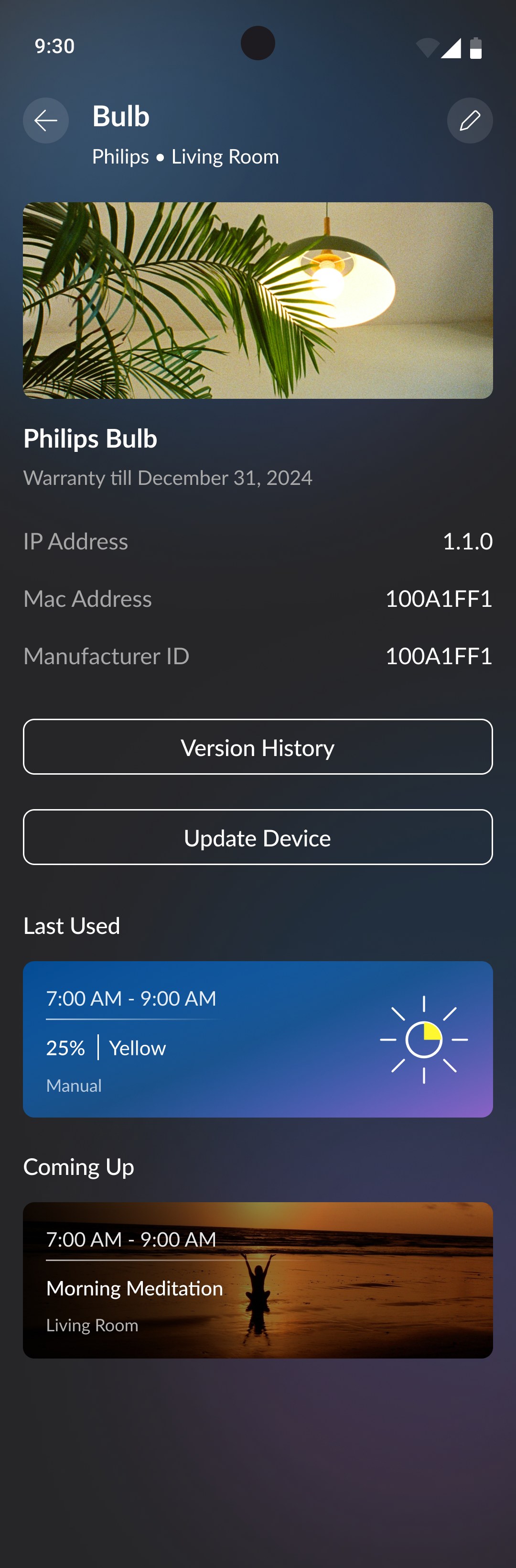
Firmware history and version detail on the mobile device page, so "current" is verifiable, not asserted.
Rollouts never interrupt use
Quiet-hours and in-use rules, because the admin's sharpest pain point was updates that disrupt the experience.
Failure is designed, not ignored
A device that misses the broadcast falls back to Wi-Fi with a visible retry state. A differentiator that fails silently becomes a liability.
11 The supporting surfaces
Energy: money first, kilowatt-hours second
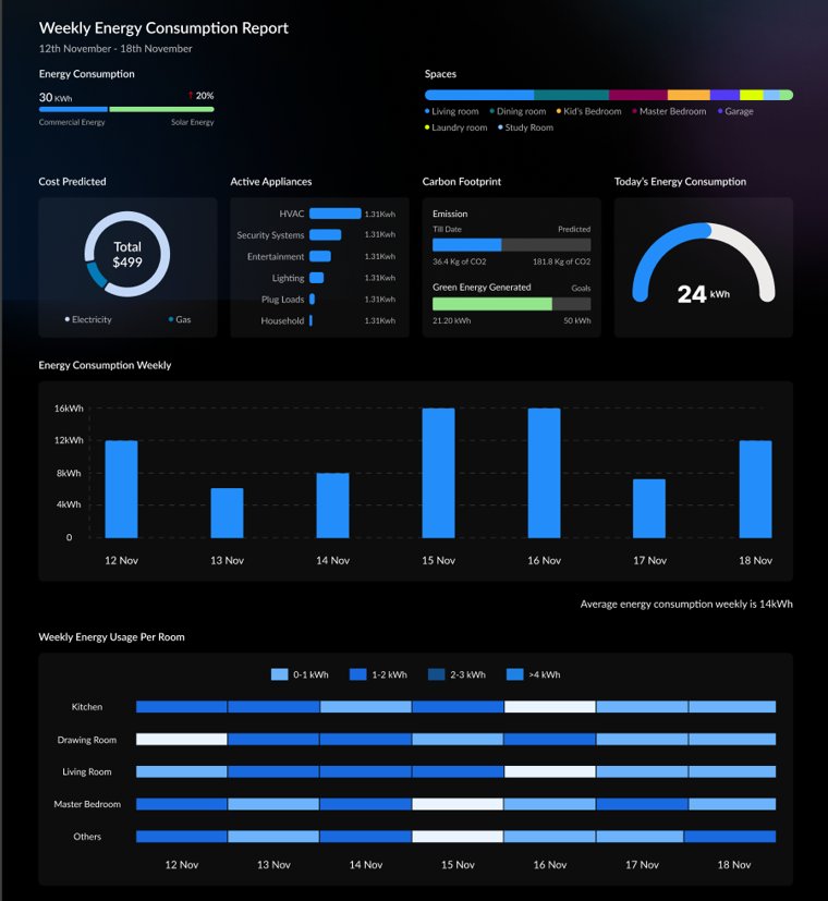
Meter data is only useful if it changes a decision. The weekly report leads with predicted cost, the number that actually changes behaviour, before consumption, splits usage by space and appliance so heavy rooms are obvious, and sets carbon against solar generation for the households where green is the motivator. Built for Mike: insight without a dashboard-tinkering hobby.
Storefront: completing the home, not farming it
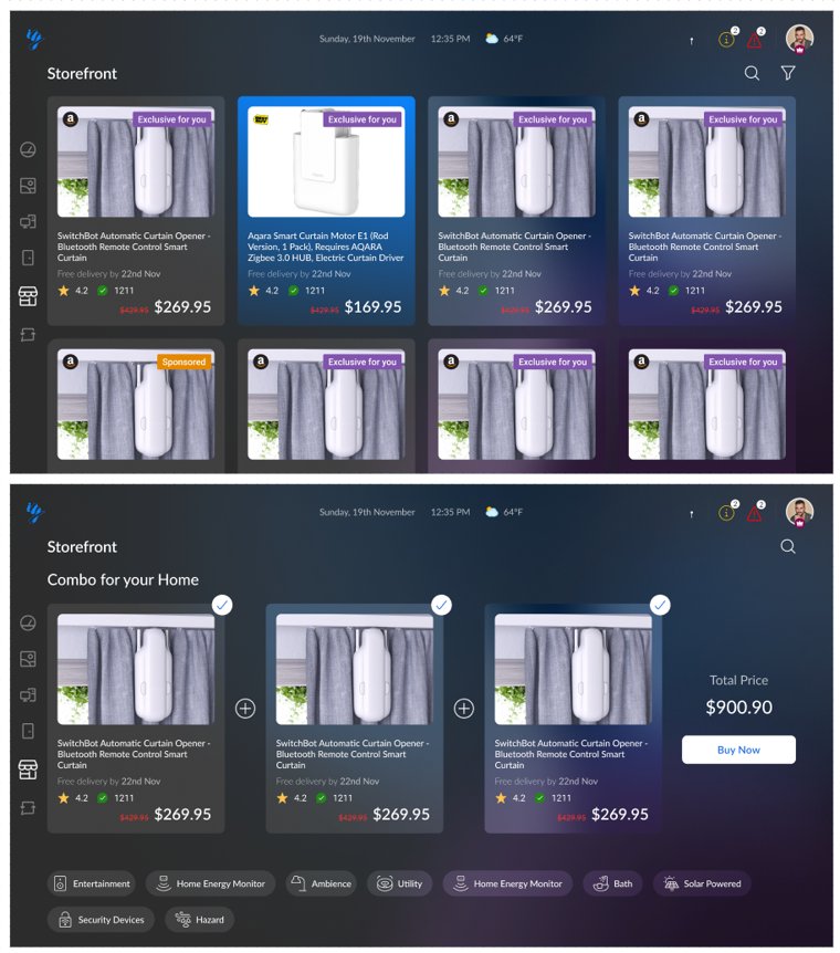
The storefront closes the loop: recommendations generated from gaps in the home's existing device graph, pre-bundled combos with one total price, and onboarding into the same unified surface. One guardrail held throughout, recommendations serve the home's completeness, not engagement targets.
Ambient mode: the home as a living map
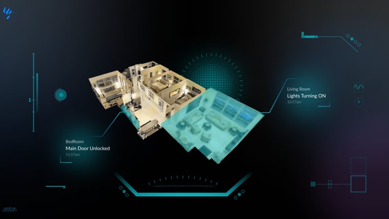
TVs idle far more than they play, and the platforms fill that idle time with wallpapers and ambience screens. iZak uses that idle time: when the TV is on but not in use, the app shifts to an ambient state, a live spatial representation of the home. Events appear where they happen: a door unlocking, lights switching on.
12 Mobile companion
The other half of the rule
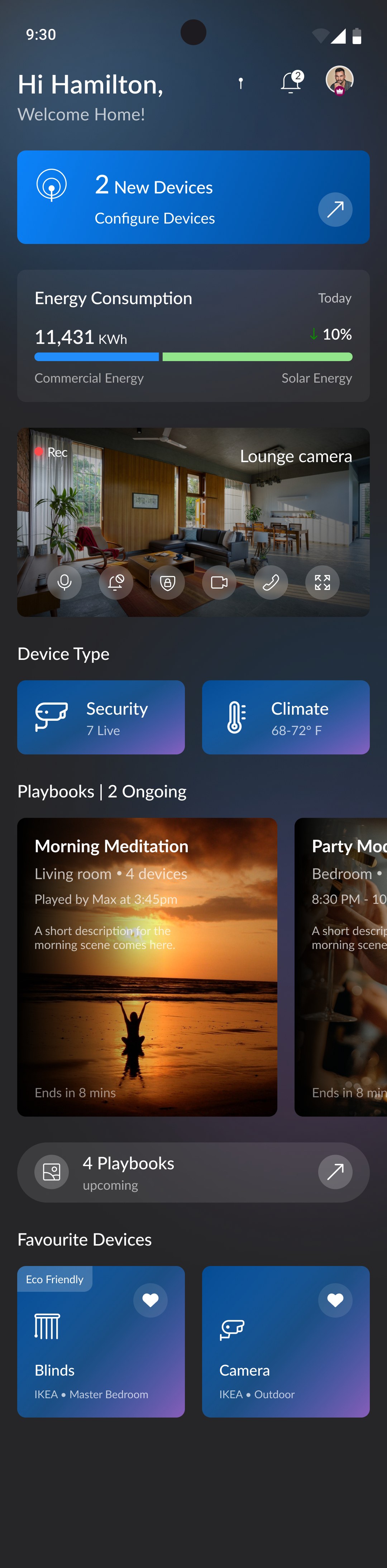
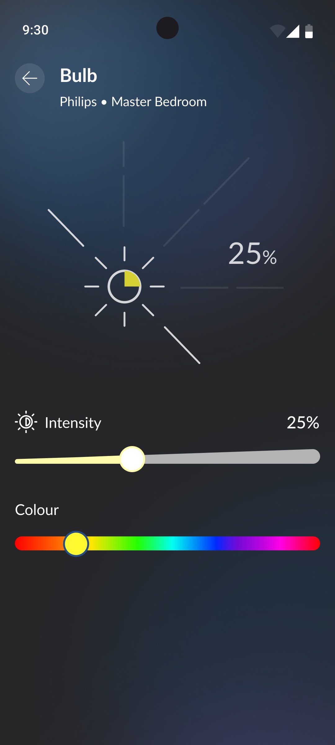
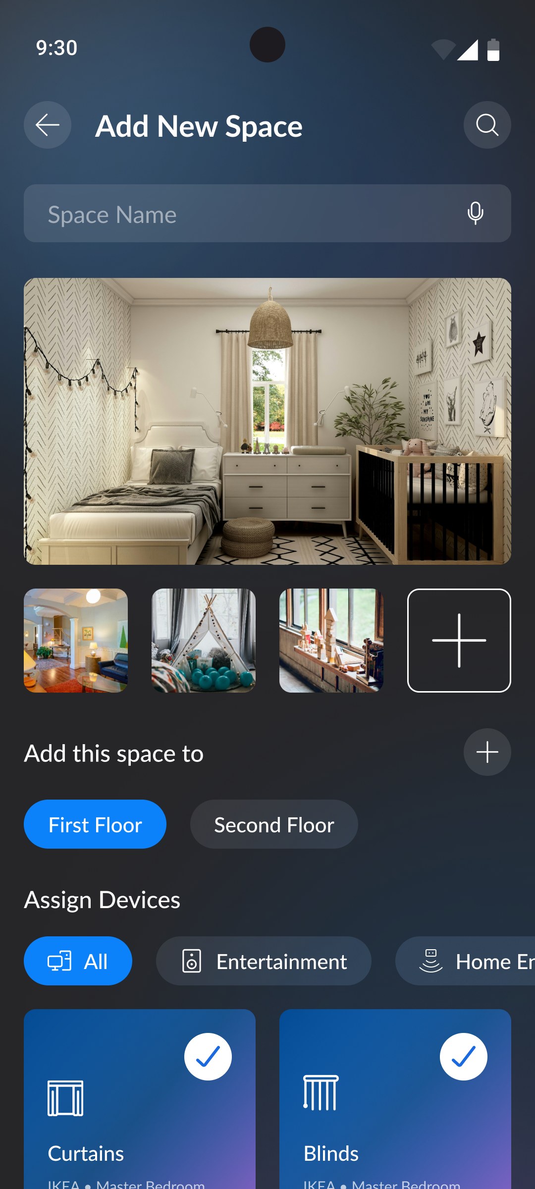
Committing to the TV made mobile load-bearing, not optional. The phone carries the jobs the couch can't: configuration, device-level depth, away-from-home moments, and space setup. Configure and act in the moment, from the pocket.
The phone shares the TV's dark system, so nothing has to be relearned crossing between them, the same components and the same language, sized for the hand instead of the room.
13 The platform behind the product
A two-sided platform, mapped before it was designed
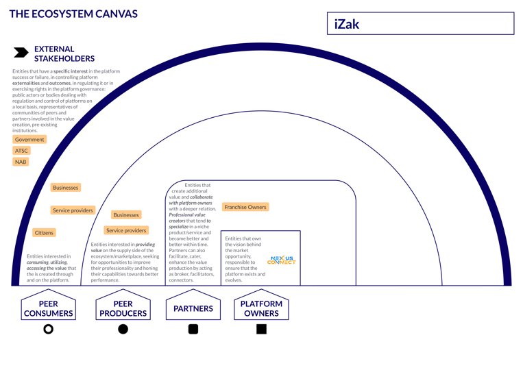
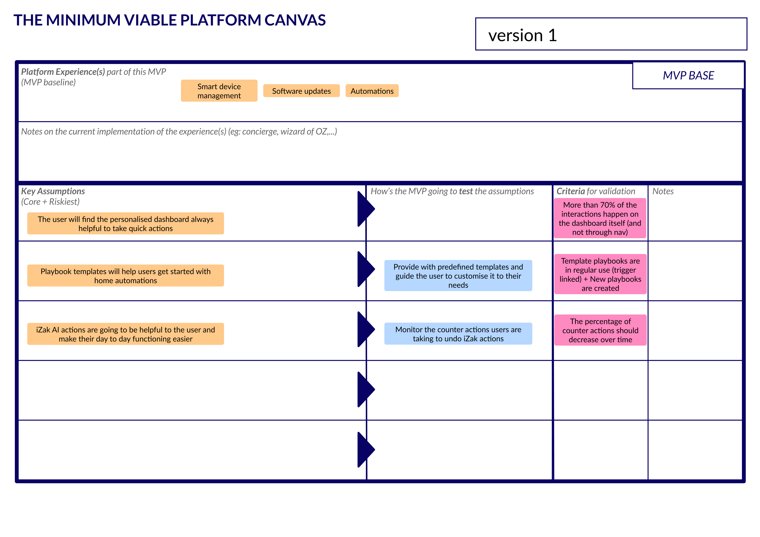
The consumer experience is the demand side of a two-sided platform. Before screens, I mapped the exchange that makes the model viable, manufacturers automating deployment and monitoring device health across their installed base, broadcasters pushing updates and content over spectrum, homeowners getting automation, control, and real-time insight, and defined the minimum viable platform: the smallest core interaction that makes all three sides show up.
The ecosystem
Ecosystem canvas, redrawn: who exchanges value with the platform, and who governs it.
The minimum viable platform
Minimum viable platform, redrawn: three assumptions, each with a test and a validation criterion.
Original canvases
The working artefacts these were drawn from.
14 Validation
What was validated, and what I'd test next
iZak is concept-stage work, and I'd rather be precise about what that means than imply outcomes that don't exist. The concept carries four risky assumptions, here's how I'd pressure-test each:
The glance test
Can a first-time viewer answer the four couch questions, energy, activity, safety, attention, from the dashboard in five seconds?
Authoring on a remote
Task completion and time for editing a playbook template via D-pad versus mobile. Below a usable threshold, authoring moves entirely to mobile and the TV keeps playback only.
Update trust
Does the Updating surface and firmware history actually shift perceived security, or is it noise?
The TV-first bet itself
A diary study on where people instinctively reach when they want to check the home versus change it. This is the test that could prove the whole premise wrong, which is exactly why it's on the list.
15 Outcome
What the work delivered, and what it taught me
The work delivered a product vision and strategy for an AIoT smart-home platform: a TV-first home dashboard and 10-foot design language, a Devices–Spaces–Playbooks model that maps to how people live, an energy surface that turns meter data into decisions, and a broadcast-update concept designed as a trust system rather than a background process, all grounded in persona, use-case, and competitor research.
Working backwards from a technology is dangerous and generative in equal measure
The discipline that makes it work is being genuinely willing to conclude "no product", that willingness is what forces the research to be honest.
Designing for a shared screen is designing a social system
Profiles, permissions, and privacy aren't features on a shared surface; they're the difference between a household product and an admin tool with spectators.
An invisible differentiator is a UX problem before it's an engineering achievement
Broadcast updates only create value if people can feel the care they represent.
The through-line was treating the television not as a screen for watching, but as the one place a household could see, understand, and command everything at home, with the hardest technical problem, keeping every device current, solved quietly in the background.
Come home to intelligence: the home, made legible from the couch.